
Find a place of significance to you to create a site-specific artwork. Responding to features of
the site, add a drawn element or select a found drawn element which you’ll extend to express
something you find interesting about the site. Relate your art work to your research in your log
and synthesise what you’ve learned about installative and environmental art with your own
interests.
Environmental Installations
- Mostly not in a gallery. Photos to document.
Found Images
- Visible but not seen. Defined by the environment but may be removed from the environment to inspire paper/canvas based images. Abstract possibilities.
Interactions
- Made by working with what is already there. Andy Goldsworthy.
Installed
- Graffiti. Something brought in to interact with what is already there, to change the way that you see what is there.
Louise Bourgeois is sculpture but it is immense so it interacts with the immediate environment.
Emily Kame Kngwarreye translated her world into paintings. Found images removed to paint?
My work for assignment 4:
A place of significance
It's December and it's cold so I'm going to take the easy option and keep close to home for this so I can keep warm. My house is a very significant place to me, and somewhere I know very well. There are several possible options but I started with the fire
 I sprayed one sheet of paper with melted candle wax aiming (not successfully) for flame like shapes.
 For another sheet I heated up the poker and used that to draw flames
 One of the poker marks was like a bird sitting on the stem of a plant.

 Lots of marks with the fire viewed through the paper.

 When I put the hot poker on the wax it ballooned over the paper.
 The marks look like flowers with burnt poker stems.
 I experimented with charcoal marks on the paper to indicate the fireplace but I'm not as keen on this. It's too busy and messy.


 It seemed only appropriate to burn the results.
 The burnt paper makes some great shapes
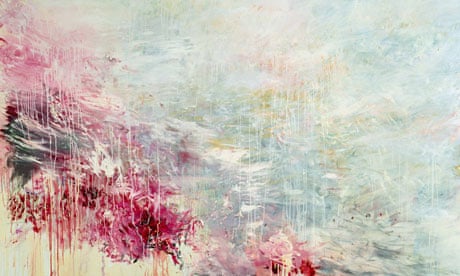
 I sponged on some red and yellow gouache
 and added red and yellow ink which makes it a bit brighter.
 This is a scan over a black background. I don't think that it works as well. The black is too bold and pulls you into the holes in the page.

This lead me to look for other artists who use fire. I found these intricate patterns made by Donna Ruff. Kate McGwire is a sculptor who uses fire as part of her work such as in this book and this burnt map.
Steve Spazuk uses a mixture of fire and smoke to create very detailed but atmospheric pictures.
Ula Einstein has some fire drawings on paper velum and rice paper.
My next idea was to explore doing something in the area around my back door. It's a shared access way with the house next door and north facing so there's not much clutter. The house was built in 1899 and there are traces of past occupants, the horse shoe on the wall, painted over with modern white textured acrylic which has peeled off in places and been painted over with fresh white leaving islands of texture and seas of smoother wall.
I took some photos and made a montage.

Photography frustrates me so I went out with my sketchbook.


The only thing that I could think of doing was drawing with wool a tree like shape (it's approaching Christmas)
 For me, at the moment, this feels like a dead end so I'm moving on.
My other place of significance is the crossroads by my house where they have just installed a bell shaped bollard which looks like it got lost on the way to the docks.


The binoculars idea appeals to me the most, the whole big brother, someone is watching you, concept. My idea is to stick a cutout onto the bollard. This will require me to pluck up some courage which I'm not sure that I have but here goes....
There is a lot of information about fly position on the net, I feel a bit like a criminal. I don't want my sticker to stay in place for very long, just enough to, hopefully, make a few people smile and to get some photos for you. It's either wallpaper paste or cornflour glue, both of which will dissolve in the rain. It's only a small piece of paper so it too should rot.


and a cutout stuck to my plan chest to see if it looks ok. The problem is that the bollard is not a flat surface to stick to but I'm hoping that because the image is small and an irregular shape it will be possible to hold it around the bollard. The other problem is that I don't want to spend lots of time applying it and I only get one chance to maintain the element of surprise which seems integral to the project. The flyposting websites talk of a feeling of adrenaline when the job is done but it's a part of the project which really doesn't appeal to me.
I did a test run on my bin using wallpaper paste.
 It's Christmas Day, not too many people around, it's now or never....


 The photos aren't great quality because its getting dark and I was rushing. I need to go out tomorrow when the light is better. In hindsight it's too small, also maybe a bit low on the bollard, its not had time for the glue to dry so back out while it's still quiet....


Better with a hat? I was in such a panic to take the photo that I didn't notice at first that the binoculars were falling off.
 As it's New Year I tried a party hat too. This time I straightened the binoculars before I too the photo.

Reflection
It's too small and the marks aren't bold enough. I simplified the shapes and lines but not enough, a passer by needs to stop and examine it to get the message, most people aren't that observant and don't have enough time, especially at a busy junction. On the plus side, I do feel quite pleased with myself for actually going through with it.
The first piece drawing with the poker was in my view more successful.
 The finished piece is, to me, more pleasing but also the methods I used to get there were more experimental. The binoculars is tight little drawing, I didn't learn very much from the execution of the drawing though I think that I gained a lot from the execution of the project.
Reflection on Assignment 4
Environmental Installations
- Mostly not in a gallery. Photos to document.
Found Images
- Visible but not seen. Defined by the environment but may be removed from the environment to inspire paper/canvas based images. Abstract possibilities.
Interactions
- Made by working with what is already there. Andy Goldsworthy.
Installed
- Graffiti. Something brought in to interact with what is already there, to change the way that you see what is there.
Louise Bourgeois is sculpture but it is immense so it interacts with the immediate environment.
Emily Kame Kngwarreye translated her world into paintings. Found images removed to paint?
My work for assignment 4:
A place of significance
It's December and it's cold so I'm going to take the easy option and keep close to home for this so I can keep warm. My house is a very significant place to me, and somewhere I know very well. There are several possible options but I started with the fire


This lead me to look for other artists who use fire. I found these intricate patterns made by Donna Ruff. Kate McGwire is a sculptor who uses fire as part of her work such as in this book and this burnt map.
Steve Spazuk uses a mixture of fire and smoke to create very detailed but atmospheric pictures.
Ula Einstein has some fire drawings on paper velum and rice paper.
My next idea was to explore doing something in the area around my back door. It's a shared access way with the house next door and north facing so there's not much clutter. The house was built in 1899 and there are traces of past occupants, the horse shoe on the wall, painted over with modern white textured acrylic which has peeled off in places and been painted over with fresh white leaving islands of texture and seas of smoother wall.
I took some photos and made a montage.

Photography frustrates me so I went out with my sketchbook.


The only thing that I could think of doing was drawing with wool a tree like shape (it's approaching Christmas)

My other place of significance is the crossroads by my house where they have just installed a bell shaped bollard which looks like it got lost on the way to the docks.


A visual mind map.

There is a lot of information about fly position on the net, I feel a bit like a criminal. I don't want my sticker to stay in place for very long, just enough to, hopefully, make a few people smile and to get some photos for you. It's either wallpaper paste or cornflour glue, both of which will dissolve in the rain. It's only a small piece of paper so it too should rot.


Prototypes....

I did a test run on my bin using wallpaper paste.


My sons preferred the look of it up here.


Better with a hat? I was in such a panic to take the photo that I didn't notice at first that the binoculars were falling off.


Reflection
It's too small and the marks aren't bold enough. I simplified the shapes and lines but not enough, a passer by needs to stop and examine it to get the message, most people aren't that observant and don't have enough time, especially at a busy junction. On the plus side, I do feel quite pleased with myself for actually going through with it.
The first piece drawing with the poker was in my view more successful.

Reflection on Assignment 4
It has
taken me a lot longer than I expected to complete this module and much of that
time has been spent thinking and researching because what I have been asked to
do is so different from the sort of work that I have done before.
I really
enjoyed looking for naturally occurring drawings, I can’t stop, it made me
think differently about what a drawing is. Interacting with the environment was
a lot harder. It gives you a much greater respect for land artists such as Andy
Goldsworthy and Cornelia Konrads. I generally lack confidence in my work and
that is exacerbated by trying to create something in public, I don’t like to
reveal anything until I have resolved it to my satisfaction, you can’t do that
in a public space. It is good to be taken out of my (very small) comfort zone
but difficult to allow ideas to develop, the temptation is to play it safe and
that doesn’t lead to making an interesting or innovative piece of art.
What I have
learnt is that the best ideas are often the simplest. They need to be well
executed and clear, ambiguity and vagueness doesn’t work in environmental art,
you don’t get very long to attract attention and engage the viewer. The rise in
popularity of environmental art may in part be due to its accessibility, both
physical (you don’t need to go into a gallery to see it) and academically (many
of the ideas can be understood by someone who doesn’t consider themselves to be
interested in art)
Because I
chose to work in my own home I found Project 3, installation less challenging.
I like the final piece with the cut-out mice and I would like to take this idea
further, it allows me to engage with a wider audience without risking showing
too much of myself, I want my art to speak for itself. I used the same
techniques for my final assignment piece. They didn’t work as well as I would
have liked because I couldn’t test the cut-outs on the bollard for size and
positioning and I didn’t design them simply enough so they are hard to read. Nobody
stopped me or challenged me when I was applying the paper to the bollard so I
have no excuse for not developing it properly apart from my own cowardice.
I am
conflicted between doing planned, controlled, safe work that I like (the
cut-outs) and work that is experimental which I don’t always understand. The
fire drawing has become something that I am visually pleased with and that grew
out of messing around without any clear idea of what I wanted to make. Although
it is innovative for me it stops short of having any meaning beyond fire burns
paper and controlled fire can make a pretty picture if you add paint. Is it acceptable
to retrospectively apply meaning? It could be about cleansing and catharsis, or
destruction.


