Sunday 29 June 2014

Drawings

 Coloured pencil studies in my garden
 
Hands and feet in pencil
Drawn on location with pen and ink
Studio model drawn with Derwent Aquatone sticks

Thursday 26 June 2014

Assignment 5 Abigail's Party revisited


I wasn't happy that my design had a sufficiently 1970's feel and I think the main lettering is to blame so I tried some hand drawn lettering
Which I added to my existing designs
Poster

Flyer front 
Flyer back unchanged 
Newspaper advert

Programme
Does this work better?

Monday 23 June 2014

Assignment 5 Promotional Design

The brief is to design a 1970's themed A3 portrait poster, A5 landscape flyer, A6 newspaper advert and the A5 cover for a programme for Mike Leigh's play Abigail's Party.
I have a much loved 1976 copy of the Letraset catalogue (cover price 50p) which is a great reference for suitable fonts.


The fonts I have that are suitable are Gil Sans Ultra Bold, Showcard Gothic and Hobo Std I'm not so keen on Showcard Gothic here but the other 2 go well together.

What does 1970's mean? Flared trousers and floral patterns Orla Kiely (ok not actual 1970's but retro 1970's) kitsch....

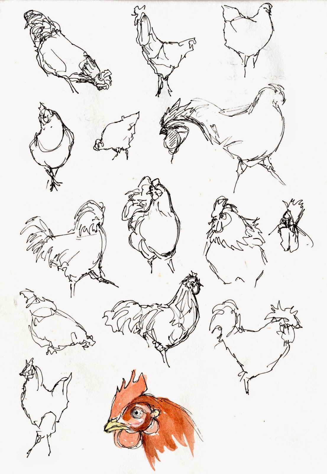
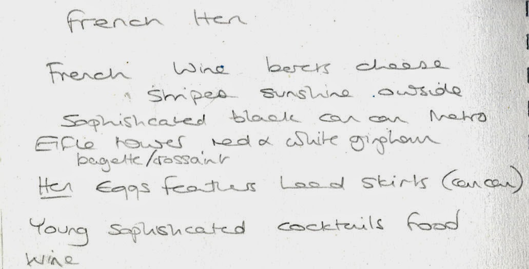
Some sketchbook ideas
 the bottom left hand drawing is from a great painting from Kim Roberti


I'm not in the flow with this yet so I did some doodle type ideas on the computer I think orange was a very 70's colour and blue is it's complimentary colour.


ok this one isn't in the right theme I was just playing

Poster
A couple of mock ups still searching for a direction, this top one is difficult to read


The orange/blue format lacks punch

 I drew some silhouettes of teenagers dancing

 and put them in a window


Having tried lots of different ideas I can't make the orange/blue format work. The black background could be more expensive to produce and doesn't have a very 70's feel but I think it is the best version.

Flyer
The flyer could look like this

or this. I think the top version is best

 the back would then be
 I tried making the glasses lighter but the lettering doesn't show up as well

Newspaper advert
 For the newspaper advert I tried to keep things similar

 but it's difficult to read
 and I think it could look dull printed in the paper so I went back to the orange background
 which I think is cleared with black type

Programme cover

In black
 or in orange

I brought the dancing teenagers back for the back page but I'm not sure they're really relevant. I think if I had access to more fonts it would be better to use Bottleneck or Candice to give a more 70's feel. The more I have worked with Gil Sans Ultra bold the less 1970's it feels but maybe that's down to familiarity?

Also I seem to have talked myself back into the green and orange colour scheme so the poster could be
and the flyer


Monday 16 June 2014

Exercise The French Hen

The brief is to create a logo to be used by a cafe/wine bar for sophisticated young drinkers.
This is an excuse to draw chickens...

 lots of chickens

 but there's more to the French Hen than chickens,
 

so maybe some cocktails?

I have tried to research similar venues but few of the places I have identified so far have a logo.
There is The Function Rooms in Hemel Hempstead
I like this from Jodie Lee Designs
 More sketchbook ideas

Which could lead to 
 I downloaded the Paris Metro font, I know its cheesy but I couldn't resist
Going off at a slight tangent

My photography skills aren't up to developing this one
I do like the chicken
but I think it needs to be more French. Maran hens have black and white stripy feathers and red combs
The stereotypical view of French dress is stripy black and white top and a red beret
More chickens
 I like the top 2 hens but their heads are wrong.
While I quite like the idea of my hen waiting at table I haven't got the image right and I want to avoid direct references to drinking
 I printed my favourite 2 out and tried different approaches. I think the effect of all of them together is pretty good.
 These are the best 2. I think the chap on the right is the best but I'm not sure he should be looking at his feet. I know that they are hens but would they make sense to someone who hasn't followed my design process?
I think the feathers are the most successful design but not like this
What about multiple feathers?
or maybe just keeping it simple
In the bar this is how it could look

Menu and beermat (bit of a wobbly hand taking the photo with my phone, can anyone recommend an image stabilising app for an iphone 4?)
 Either as a small emblem on the T shirt or a larger logo
 and similarly for the napkin


In contrast to the last exercise, although I found it hard to get started I really enjoyed this project and I' m much happier with the results