Tuesday 28 June 2016

Drawing machines


Find something which moves and attach a drawing medium to it so that it creates a drawing by itself. 
A felt tip attached to clockwork chattering teeth. I did start with charcoal which made more curving lines of short choppy marks but sadly they didn't show up well. The felt tip makes the same small lines but tends to just move forward.

Looking at some examples of other drawing machines. Using motors and robots. The DuoGraph which is a new more sophisticated take on the Spirograph from my childhood, and often more figurative work from Harvey Moon who has some interesting projects such as the drawing controlled by the cricket. I was inspired to try and construct my own machine. I tried deconstructing another clockwork toy but couldn't attach a pen to make a mark. I explored rubber bands and cardboard and spinning pens which didn't really work. Suspended pens did make a mark which curves nicely in between short lines and dots.
Hanging the paper seemed a good idea but the weight of the pen stopped both pen and board from moving independently. I filled a plastic bag with slightly diluted gouache and made a pin hole to use suspended instead of the pen but the paint fell in drops rather than a steam. I'm sure it's possible to fix but it could take a lot of time.

My first thought when I read the brief "You might use a remote control car, a clock face, a door which is opened regularly, the foot of a dancer." was to use the trace of an ice skaters blade on the ice.

It's hard to see what you're photographing as the light reflects off the ice which adds an element of uncertainty to the exercise. I took 6 photos of an area where I had been practicing spins. It's not very clear at first but with a bit of Photoshop intervention I think you can see what is happening.
Incidentally the reflection of light in the ice makes an interesting pattern when the photo is inverted.

Using the trace of my skate on the ice as the basis for my developed piece and started by printing the photo at A4 size and tracing the lines
Then I drew it again in multicoloured pencil 
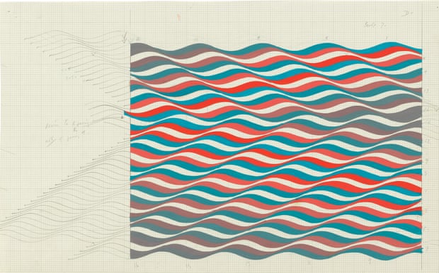
Which is a bit dull so I tried some big sweeping drawings in pastel 


Then carefully copied the shape and added some coloured pencil
This has the feel of a Charles Rennie Mackintosh flower but I'm actually seeing big hats on a sunny day, Ladies Day at Ascot. Its not a design that is easy to repeat so instead of thumbnails I printed out some copies and tried colour using crayons.


They are a bit feint but I like the bottom version best, particularly the purple lines which feel like movement (this happened accidentally as I scribbled in colour).
I copied the design onto a larger sheet of sugar paper and added colour. It was, surprisingly, easier to make smooth pencil curves on a larger drawing.

The colours are a bit bright but I wanted the feel of well cared for green grass and extravagant hats on a sunny day, maybe I'm trying to be too specific and not letting my audience make up their own minds. I don't like the purple lines in this larger drawing. Everything else is smooth and the lined area looks unfinished.
Removing the lines makes the purple area look like a flat balloon but I think its the contrast with the white.

This is a little bit better but removing one area of white makes the other look odd and unbalances the picture.
Now its too pink and I've drawn the life out of it. The rough had more energy and potential so I strengthened the colour and used a little water to soften the green of the background.
At this point I told myself to stop and move onto the next task, but just one more version.....
White on a neutral background suits me well, but it needed some colour.
This time I resisted bright colours and went for green grass and sunshine yellow maybe inspired by John276778 who posted a photo of scattered yellow flowers on the Personal Voice thread in the Coffee Shop forum.

It's difficult to preserve the energy of the original lines once you start to draw them carefully and the temptation is to tidy the original. However it is nice to have the freedom to remove splodges and random lines that don't fit with my vision of the design. Having an automatically generated original to work from frees me to make something different to my normal style. I do prefer the lines that I drew myself because I am a bit of a control freak when it comes to my own artwork!

After I'd finished I found this video of drawing machines made by Fine Art students at Batley School of Art and Design which shows them successfully doing what I failed to achieve with my clockwork toys.

Research
Rebecca Horn Projects include Activation Real Time The machine creates a simple movement which is repeated inaccurately so that the marks overlay each other. It is complex because it is repeated many times but simple because the machine is unable to do more than a few types of movement so the marks are similar. The piece is better explained here I also managed to find this video of some of her machines. I don't think that I haven't found links to all her work although I checked all the libraries and galleries on the student website.

Her machines are artworks in their own right, clever interesting and thought provoking, but I don't see them as drawing machines apart from Activation Real Time or the machine that dips into the water towards the end of the second video. I guess the machines draw invisible lines through the air but surely to call them drawing machines complicates the description and takes attention away from what they do well which is to bridge the gap between humans and machines. I think she is exploring how a machine can be made to be vulnerable yet able to perform to an audience in a gallery. By doing this she is exploring how humans function.

Research Point - Gesture and emotion


The Abstract Expressionists’ use of gesture was caught up with notions of authenticity and even of purity of intent. The influential critic Clement Greenberg wrote in his article ‘Avant Garde and Kitsch’ in 1939 about the good artist painting ‘cause’ and the bad artist painting ‘effect’. He also talks about what he describes as ‘the inflections of the personal’ becoming a legitimate subject. For example, the artist Jackson Pollock talked about wanting to paint from his emotions, not to illustrate them. What’s your response to these comments? 

Clement Greenberg's theories about art are summarised here and Jonathan Jones talks briefly about his legacy here. I read his essay here He has an interesting point about abstract art "The avant-garde poet or artist tries in effect to imitate God by creating something valid solely on its own terms, in the way nature itself is valid, in the way a landscape -- not its picture -- is aesthetically valid; something given, increate, independent of meanings, similars or originals. " If you subscribe to his theories artists can only produce valid work if they invent new images. To look like something else is derivative rubbish.  If that is the case then it is not valid to use art to draw attention social issues or make its viewers look at the ordinary more closely and hence better appreciate the world around them. An artist can paint from their emotions and still produce a representative image which is visually striking and academically valid. Surely the best art works as an interesting image with layers of meaning which can be extracted over time, and may change as time goes on and the viewers personal perspective is changed by other factors.  I disagree with Mr Greenberg on all counts. (My other problem with him is his pompous assertions that fine art and culture is for the privileged few and the rest of the world is not capable of appreciating it and can only understand a dumbed down version that he calls kitsch.)

I think that there is space for Jackson Pollock painting emotionally, and others who are more comfortable, or capable of, illustrating a point in their paintings.  Audiences are capable of appreciating both viewpoints if the work is done well. I would argue that Edvard Munch's The Scream is an extremely effective painting of a strong emotion which, for me, seems very illustrative.

I do however agree with the Abstract Expressionists that gesture, and the manner of mark making conveys something extra to a drawing or painting on top of the basic image. As rushed, hesitant or careful line will each be interpreted differently on the page and say more about the artist's intent for the picture. It is surely highly desirable to feel an emotion so intently that you will convey it in an artwork.

Sunday 12 June 2016

Study visit British Museum Drawing Collection.

Who knew that the British Museum holds the national collection drawings? or that Bridgit Riley cared enough about drawing education to be involved with setting up drawing workshops there.

I was lucky to be part of a group of OCA students who went to the museum on Friday to examine drawings from artists as diverse as Goya, Raphael and De Kooning. The visit was well organised and attended by a students from writing and textiles as well as fine art so there was not pressure to complete the perfect drawing.

The curator discussed the drawings then we had time to study and  draw from them. She included this study by Bridgit Riley which is absolutely captivating in real life.  The Guardian has this review of her work from an exhibition last year from which I found the study.
 I drew this from a sketch by Adolphe Menzel who was a very popular artist in 19th century Germany. His drawings are beautiful and the way he slotted them together to fit them on a single sheet of paper has a very modern feel.
 This is a sketch of part of a large (A2 or A3) drawing by Ariane Laroux who is a French artist (website here) who draws people as she interviews them. She uses lots of short choppy lines to make shading and depth. I can only find information about her in French but she has some work in an exhibition later this year in Poole of work from the British Museum Collection.
There were some drawings by Frank Auerbach outside the study room and one of his sketches inside. I do like the energetic way he uses charcoal in his bigger drawings to sort of carve out his figures and I am starting to appreciate his landscape drawings. I am interested in the way he documents the same area of Primrose Hill and how this might relate to my approach to my parallel project.


Wednesday 1 June 2016

Part 3 Project 2 - Experiments with mark making

"Make yourself some drawing tools by attaching pencils or pieces of charcoal to the ends of bamboo canes or similar. "
I share my house with a cat and a dog who sit on anything on the floor so it seemed logical to do this exercise outside. Drawing standing up changed the perspective of familiar views. I started looking over the fence to a collection of buckets and barrows balanced on my neighbours aviary which aren't in view from a seated position.


The first drawing is in charcoal. It wasn't too hard to draw straight lines but the bushes were tricky until I found that I could make small flicking marks but using the natural bow in my sticks which were branches from an overgrown fir tree. The dark area above the aviaries became messy and overworked.
Adding colour corrected this. I've tried to keep it simple but I think the pattern of the garden fences is boring and ill described. The shed worked quite well. I mixed coloured pencils, water-soluble crayons  and felt tips but had to remove one of the green felt tips as the mark was too overpowering for the other gentler colours.
In search of a more interesting subject and composition I made some drawings in my sketchbook
The view of the backs of neighbouring houses was the best composition

This time I drew with a 4B carpenters pencil which doesn't seem soft enough to be 4B then added stronger lines with a regular 4B pencil. I like the wobbliness of the lines and the way I have been forced to be simple and decisive in my line making rather than scribble hopefully.
The bricks are a variety of shades so I used a mixture of coloured pastels which are too bold and dominate the rest of the drawing.
I added highlights with white conte attached to the stick
added more pastel and then used a broom to blend the colours by sweeping. By this point the original pencil lines were very feint so I attached a paintbrush to my stick and redrew the main outlines in black ink.

I'm still not happy with the dark bricks so I used blue purple and green pastels to darken the roofs.
Which made the sky look bland so I used blue white and yellow pastels in sweeping strokes before the pastels crumbled to nothing.
Has it become too overworked now?


Reflection: What happens when you break the relationship between your brain and the marks you make in this way

I'm not convinced that this exercise does break this relationship. As with using any different tools it changes the way I make marks but my brain is very much still in control.  The media dictates what the drawing is capable of, the level of control is just different. To work with the long sticks I found that I needed to physically move around the drawing to make the marks that I wanted with the level of control that I had. I don't think the drawings are particularly good but they're not bad drawings either, they made me be more decisive but also more open to the part that the media plays in making a drawing. An artist responds to the image they want to create and constantly re-evaluates the way that the drawing is shaping up as it develops. They are made better drawings because I have less sensitive control and have to work more freely and respond more openly to my subject.