Monday 25 May 2015

Exercise 2 - Your own face

Quick studies in pencil. To avoid looking straight at myself as I drew I set up two mirrors so that I could get a different angle. 

This proved a bit tricky, I need a bigger mirror, but gave me an interesting angle although I had to crouch on the floor to see myself.
I'm actually surprisingly pleased with this which was done in charcoal and light grey conte on sugar paper. It went through a very dodgy phase before I got to this point.
My tutor has challenged me to try different supports so this is an experiment, oil pastel on the expanded polystyrene base from a pizza.  I gave up on the two mirror arrangement for this one but didn't highlight my eyes which is easy to do with glasses!
As that was very experimental I did a third drawing with coloured inks and a dip pen. There is a splurge of red ink in my hair and I've massively overworked this one.
This is definitely my best attempt. In real life it looked ok but when scanned it made me look as though I was wrinkling my nose as though there was a bad smell so I've tampered with this version
I looked at Rembrandt's many self portraits. The reason did so many is not known though there is an attempt to explain them here it appears that portraits of famous people were popular (celebrity culture is nothing new) and saleable. The concept of the self as an independent entity did not exist until many years after his depth so the attempt to explain them as a series of self analysis is unlikely to be correct. Whatever their reason or purpose they are a striking set of images that give an insight into the man who painted them.
Van Gogh painted self portraits for practice and enquiry because he couldn't afford models. He was prolific, trying to gain a reputation which would lead to commissions and payment for his work.
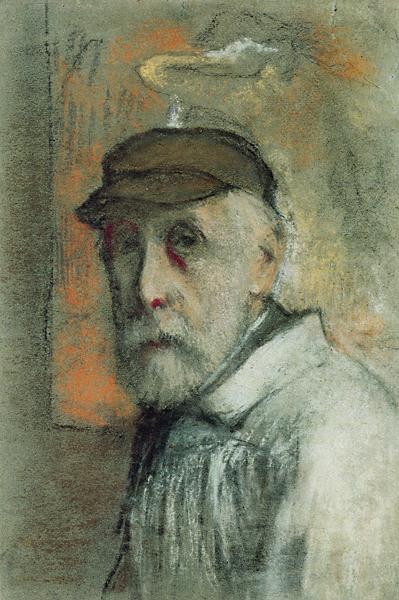
When asked why she painted so many self portraits (55) Frida Kalo said "Because I am so often alone....because I am the subject I know best." There is a summary here of a number of artists over a number of years. The Guardian claims that these are the top 10 self portraits, I'm not sure that I agree, it's a pretty bold statement. I was particularly drawn to Artemisia Gentileschi's painting which is purposeful and powerful and at an unusual angle, I guess she used mirrors? This pastel drawing by Degas is subtle but you feel the intensity of his enquiring gaze. I've also become excited by Zinaida Serebriakova who I found completely by accident. She painted and drew figures, still lives and landscapes. Her self portrait At the dressing table doesn't look like a self portrait at all and shows her mastery of draughtsmanship. Tracey Emin is very interesting. She has a lot to say and a big personality to maintain but underneath she is a skilled artist and that can get overlooked. I loved her drawings. I remember an old art teacher who had seen the My Bed installation commenting on the quality of the watercolours that were part of the display, I'm afraid I never saw it myself. Her self portraits don't follow the expected form and I love her Self portrait as a small bird Who says that self portraits have to be representative? 
Phillip Butah is a contemporary artist who draws accurate portraits but leaves the edges unfinished and a lot of the paper unfilled. The results avoid photorealism by leaving the pencil marks visible and placing the face in an abstract environment. He has drawn himself regularly and it's not always clear whether his drawings are of himself or a model. I love his work

Project 6 Exercise 1 - Facial features

So I started with noses in biro and then coloured pencil
Then went on to eyes, ears and mouths (and a few more noses.....)
It's hard to make a feature look right without it being part of the face as a whole, especially mouths. I also struggled to keep focused drawing from small photos in magazines or on the internet of dull identikit models who have little character.

I looked at drawings by Graham Little . His models are so still the might be dead, the very antithesis of the earlier exercise looking at movement. In contrast I prefer Elizabeths Peyton's drawings because they look like real people who could get up and walk away at any time. As noted before I loved John Singer Sargent's drawings and Cezannes sketch of his wife. Scott Burdick's drawings are so much more interesting than his paintings although the paintings are very good. Mary Cassatt's paintings and drawings of women and children are lovely and not too formal and I like this self portrait by Camile Pissarro. I wish I had seen this exhibition of the drawings of Watteau who was an absolutely amazing draughtsman.

Sunday 24 May 2015

Project 5 - The moving figure Exercises 1 and 2

The course notes direct me to David Haines. The link supplied doesn't work but I like the feeling of movement in Radiant BodiesNew balance sneakers vs KFC bucket is slightly disturbing. Both of these drawings sit better with me than Boy with a laptop which is stiff and frozen in space. In contrast I really like the work of Richard Hambleton which has loads of energy. He must have influenced this illustration.
Whilst researching I stumbled on Liz Milburn who draws and paints figures engaged in sport. She uses a variety of techniques from simple line to loose brushstrokes to give the feeling of action.
Also there are some images from an advertising campaign here which use curved strokes to describe a running figure which I feel is successful.

I've combined exercises one and two in one post because the drawings I've done overlap so much. When the subject is live figures you just have to grab the moment and draw what you see before they run away.

 As usual there are a lot of drawings, I have spared you by not scanning them all. The 2 pages above were done of people walking past my window so I had very little time to capture them. I started out with felt tip and quickly moved to a fineliner. The drawings on the first sheet where I didn't take the pen off the paper are surprisingly lively. This is a technique I borrowed from Veronica Lawlor

 People in the park drawn in a A5 sketchbook with graphite pencil, colour added afterwards with coloured pencils
 People waiting for a train (pencil sketches)

 Experiments with smudged charcoal and continuous line looking for a better way to describe movement.

 More live figures with a fibre tipped pen and added coloured pencil on coloured paper.
Workmen in pencil with added yellow pencil.
And trying to draw Eurovision off the TV. I started with graphitint pencil but quickly changed to fineliner with red pencil.

I need to make myself draw my stolen models with a background. I get so caught up in capturing their movement I leave them just floating in space. The quick sketchy drawings work better than my more finished drawings of skateboarders for Assignment 3. I need to workout how to blend this style into a more complex background.

Monday 18 May 2015

Exercise 2 - Three figure drawings

I think I may persuade a model to lounge or sit but I'm unlikely to find someone who is willing to stand for 30 minutes so I dragged the mirror down from upstairs.
This is the best pose
 I used Tombow markers and tried to layer colour although some of them are rather dried out.


At the end I softened the colour in places with water.

Encouraged by this I decided to draw myself seated, this time using a brush and acrylic black ink


This worked out better than I was expecting. I just lightly sketched in the chair as I didn't want it to dominate the scene but it looks too flimsy to support the figure so I darkened it.
For my lounging figure I caught Lisa while she was studying. Preparatory studies...
Charcoal and white conte on sugar paper. In the photo I could see that the head is too small
So I modified it.
I'm not enormously pleased with the result but it's ok. As Sam was here too I drew him as well


 He's a bit of a fidget so the studies needed to be brief. The big drawing was again in charcoal and conte on sugar paper.


Somehow I like this better though I'm not sure why.

Project 4 Exercise 1 - Structure

 Drawing myself and from photos in a magazine
 Which was a bit limited so I got Barrington Barber's book from the library


I also borrowed a book about Leonardo Da Vinci's drawings and copied one of his studies of muscles, and looked at studies of the elbow and knee in Ron Tiners book Life drawing without a model Although I found this exercise initially interesting I've started to get bored with copying in detail so the later studies aren't as detailed.
Whilst researching narrative I came across the beautiful work of Laura Ferguson who has used CT, MRI and dissection to examine the inner structure of the body and made fascinating etherial drawings on mystically coloured paper.

Tuesday 5 May 2015

Exercise 4 - Energy

Short poses each about 10 minutes.            .
Pencil
Graphite stick
Pencil
Graphite
Conte
Researching drawn representation of movement I read Chapter 16 of Ian Simpson's Drawing Seeing and Observation which was a set text in a previous course. He is of the opinion that drawing cannot represent movement which sounds a bit defeatist to me especially when you get people like Ron Tiner in his book Figure Drawing without a Model doing a pretty good job to my eyes. He is maybe more representational than artistic but his explanation of the "definitive moment" being the best pose to represent a fluid action makes visual sense to me.

I looked for artists who have managed to create a sense of movement. Eddie Pena and Veronica Lawlor, Rob Appleby Christopher Williams What seems to unite them is a lack of detail. Eddie Pena and Veronica Lawlor use continuous line to seek out the form of the figure. I tried some experiments in my sketchbook.


It needs practice by I think the continuous line technique has potential. It worked better when I had a definite view of my subject, fleeting glimpses didn't give me enough time to assess what I wanted to record. All of these drawings were done from the window of my front room watching passers by on the street so I had very limited time to draw them but had the advantage of being unobserved (and as it was very windy I didn't blow away!)

Monday 4 May 2015

Exercise 3 - Stance

pencil
Again working retrospectively from previous drawings I've added the central line after the drawings were finished.                                                                                   

sepia conte

sepia conte
The above pictures were all quick sketches done at different sessions. The picture drawn below was a longer study with coloured pencils probably done in about 20-30 minutes

Tutor feedback

My tutor suggested I lookout the work of Ellen Altfest for her contrast of quiet and busy subjects. Her compositions are interesting and unusual but I'm not a fan of her slightly hyper realistic style. He also suggested developing the fracture viewpoints of some of the earlier pieces. This is something I have never tried before although accidentally I have sketchbooks full of fractured viewpoints as I try and fit lots of different images onto the page.  I would like to see Lisa Milroy's A day in the studio in full size. I like the idea of the series of postcard like images and I am drawn to the everyday and the ordinary.
He comments on my measured way of working which I think I understand though I have always thought that I am drawn to the figurative, but the measured is probably a better way of describing what I am trying to achieve. I want to balance this with loosened and spontaneity to keep things lively, I don't like hyper realism. He pointed me to Bernadette Kiely who creates atmospheric, loose but believable (measured) paintings and drawings of landscapes, and  Hughie O Donoghue His figures have a rather gory feel to me, he is very fond of reddish orange tints mixed with black and flesh tones. I do quite like his landscapes.
Stephen Brandes does very literal looking drawings of imaginary places. I like the way he combines words with his images but I am a little confused by the use of lino as a support. the pattern can be distracting in some of the pictures but maybe that is the point. It must make for a lovely big surface to draw on.

Exercise 2 - Essential elements

The light at the art society studio sessions is pretty flat so I apologise that this doesn't quite fulfil the brief. Also there are only four views in this series drawn in watercolour with a brush and highlighted in places with a fine liner pen. In the first three poses the model is twisted and leans away from her axis.
so I have included four other drawings from a different session.
Graphite stick
This is my least successful drawing of this series. The pose is stilted the foreshortening not represented, the feet too small and the face overworked.
Graphite stick
charcoal
sepia conte
This is my favourite drawing in this series. I loved this model who had a real presence, the conte used both loosely on its side and end on to create bolder lines made it easy to convey the bulk of the model.