Thursday 24 November 2016

Part 4 - Project 3 - Installation

The text supplies this link, to look at artists doing installative drawings, specifically;

Robert Rauschenberg, The Automobile tyre print in the exhibition is a different way to create a drawn line with something from the everyday. It also breaks out of the confines of a conventional artwork because it takes up so much space it will demand attention on a wall.

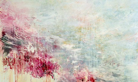
Cy Twombly also here There is an energy about his drawings and he used colour brilliantly. His flower pictures are like tattoos, they move beyond the merely decorative to become expressive statements about the beauty of the flower. 

Ellsworth Kelly, The drawings in the exhibition are experimental, their importance is in the originality of the ideas and his willingness to experiment with the medium of drawing. Whilst following links I came across his "Pine Branch and Shadow " photo which links into the found drawings of this section of the course.  Although they aren't installative I have always admired the simplicity of his plant drawings which are so economically line yet so clearly convey the essence of the plant they represent. They draw your attention to the beauty of the shape.

Karel Malich, His drawings are free and simple like doodles but somehow more considered. I like the way that the lines follow each other partly overlapping as though he is struggling to find the right line that conveys the idea but also they gain something in being not just a line but one of many lines. Uccurance on the Circle in the Flow of Energy, 1973, is a good example of this, and for me a better drawing than the one in the exhibition. Fascinating to wonder how he managed to link the lines and keep them together . How much was planned and how much was happenstance?

 Edward Krasinski How do you make all your work have a house style? link them all with blue tape. The tape is like a installation highlighter pen making the ordinary and overlooked stand out. Then how do you deal with failures in transport? Krasinski dealt with adversity by seeing new opportunity. He obviously delighted in the technology that allowed information be transmitted instantly. With modern technology it is easy to overlook the miracles of communication so in a way his work was ahead of its time and predicted modern apathy.

Pierrette Bloch  better appreciated in this video Her work moves gently with the passing breeze which animates it. This is a sort of living drawing rather than static marks on paper. She uses unusual drawing materials such as hair and repeated marks which gain more significance when they are grouped together. 
 A few days later I saw this vapour trail which reminded me of her work.


I started by doodling some ideas in my sketchbook.

Then started drawing in the walls......
 There was a crack above the light switch Which grew leaves and a flower. 
 I Googled owls and found one in flight which looked a bit like this.

 I think that it's better without the added eyes.
 Back to the sketchbook ideas.
The spider didn't work very well partly because it was drawn in crayon because I didn't fancy being stuck with a failed spider drawn in sharpie which I couldn't rub out. 
The other idea was mice which I drew in ink on brown paper and cut out.
 I then got completely carried away sticking them around my house with Blu Tac...


The influence here is definitely the work of Slinkachu and Isaac Cordal I like the idea of installing work that only the observant will appreciate. 
Randomly Kurt Pertl came up on my Facebook feed, the figure looks so at home, so natural in the landscape. 
I had never heard of anamorphosis although I have seen Holbein’s The Ambassadors  It's a really great idea but I think Holbein was just so excited with the innovation he overlooked that viewed from the front the picture appears to have a large smear running across it. I looked up Edgar Mueller and Kurt Wenner who make some mind bending drawings. I know that they want to keep their methods to themselves but it would have been great to see some photos from a less favourable angle, I would have been even more impressed.

Pierette Bloch here and here. The video with the horsehair gently wafting in the breeze helped me to understand better than the photos. Many pieces of art are better appreciated in isolation but her splodgy black blobs of paint improve when you scroll through Google images looking at lots of them. Her materials are described as poor because they are readily available to anyone. It's what she does with them that is important. Using cheap readily available materials to make art must help the artist to be less precious about what is created. If it all goes "wrong" however that is defined, the only thing that is wasted or lost is the time it took to create the piece. I also feel that her work is more accessible because it isn't fancy expensive things, and the simplicity of the shapes and lack of colours makes looking at them a more calming meditative experience.

Before I did this course I saw Louise Bourgeois sculpture in Washington.
It's not a great photo but it gives you a flavour. I found the sculpture fascinating, maybe, in retrospect, that has something to do with an association with drawing. The legs appear to have been drawn out in metal from the solid body. The sculpture is delicate in design but looks so strong and powerful. Maybe that is an association with spiders which we imbue with greater power that their small size and fragility should command. I do see this sculpture as a three dimensional drawing very much in the same vein as Pierette Bloch's horsehair drawings.

Saturday 5 November 2016

Feedback on Assignment 3

The drawing blindfold project was weak and it was suggested that I look at the work of Claude Heath. There are some great loose free abstract lines and it was immediately apparent that I had given up on my drawings too quickly. This is a consistent theme with my work I need to keep pushing a failed drawing as perseverance is where the improvements and discoveries are made. I found Heaths work difficult to get close to without a written explanation but fortunately I found one here and here. The use of an anchor in the form of a blob of Blu Tac would definitely change the way that a blind drawing evolves. Heath also says "skill in drawing was something to be on my guard against, that it could replace meaningful content if you were not careful" This is a completely different approach to drawing to me, and maybe represents a more academic or educated approach to making art? 
I had another go, first using the Blu Tac anchor and a random purple felt tip.

The anchoring helped with the drawing of the lamp but its still stilted dull and squiggly. You might like it but I found it very unsatisfying. The thinner lines were Bic biro, still very squiggly but the computer mouse (mid right hand side) might hint at something more interesting. Part of the problem is that the drawings are too small, though if it gets too big I won't be able to stop myself seeing what I'm doing without some more technical equipment. These are biro again, about A3 size, I abandoned the Blu tac which was distracting me with it's stickiness;
 This one works best, the multiple lines give a feeling of movement and fractured views
This is more like a bike but not detailed enough, again I stopped too soon. Once you've looked at the drawing the spell is broken and you can't continue in the same way, the relationship with the resumed drawing is different. In both drawings things worked best when I relinquished control and let my hand move freely from the arm rather than fiddling. I can see potential here but it still don't find the process of creation satisfying enough to hold my interest. I might try this again when I need a creative kick.

For the Drawing Machines project my tutor suggested I look at Tim Knowles  specifically his drawings made by trees Its a great idea but I don't feel that they make enough movement to get an interesting enough trace. I prefer his drawings made by the movement of cars which create some interesting lines and curves, controlled but random, and the Nightwalks photos which are atmospheric and beautiful. The variety of his ideas are exciting.
My tutor asked what is the role of the artist when using a drawing machine? They are the generator of the ideas but also the editor of the finished product, choosing what and what not to include. Photography plays an important role in this sort of art, documenting the project but also creating visually pleasing images of the set up which may be more interesting than the finished drawing. Again there is the theme of loosing control which makes a more fluid drawing and a more interesting response.

Other Artists;
A variety of projects around the theme of "threat, constraint, resistance and adaptation" Channel your angst involves the the participants constructing of the web that constrains them. They seem to find it enjoyable, like a three dimensional version of the childrens' game Twister. the project demonstrate how we create our own boundaries. There are some bold charcoal drawings in the film from her project Fitting In which involved occupying the Minories Art Gallery in Colchester. It is interesting how she takes the drawings project further using film and performance. The smudgy results of her Action Drawings seem more valid when set alongside the film of her and Darren Ellis writhing in charcoal in the gallery and if this is viewed through the themes of constraint and resistance it is an understandable response. I became a bit impatient with the film, I preferred watching them occupying the gallery where different angles views and times are played out concurrently on a divided screen. It held my attention as I tried to link the action between the frames. I am interested in the details of ordinary daily life which so often goes unnoticed and I felt like a spy watching a security camera.

Sticking with charcoal I was immediately attracted to Length(Fraction) it's even more interesting when you see how it was made, dramatic and physical. (Then I got distracted by geometric shapes at Polyhead) There are different shapes made by different folds but you have to work through the websites to see them. His work is very geometric and simple. There are some three dimensional sheets which peel off the wall. I'm not so taken with the planks or columns but I guess that they may have more presence in real life.

I usually start my research by Googling the artist then looking at images to see if anything catches my eye. With Lucy Skaer I'm struggling a bit. A lot of busy looking images come up on first search. I did find this piece about a film which does sound interesting. I looked at her pages in Vitamin D which led me to a more interesting set of drawings. I'm squeamish and a bit disturbed by her drawings of corpses which feels like an imposition on the newly dead but if I forget that then A Problem in Seven Parts is visually appealing. Should I be responding to the back story and the meaning of a piece or my gut reaction to what I see? The two are often very different. this drawing has similarities to Diorgo Pimentao's monochrome work, I'm not sure what it is called as I found it by Googling Bevelled Map 2004 which gives me a completely different set of pictures than what I have in my book.