Thursday, 24 November 2016

Part 4 - Project 3 - Installation

The text supplies this link, to look at artists doing installative drawings, specifically;

Robert Rauschenberg, The Automobile tyre print in the exhibition is a different way to create a drawn line with something from the everyday. It also breaks out of the confines of a conventional artwork because it takes up so much space it will demand attention on a wall.

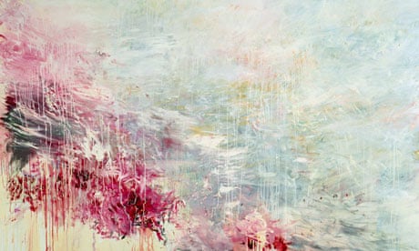
Cy Twombly also here There is an energy about his drawings and he used colour brilliantly. His flower pictures are like tattoos, they move beyond the merely decorative to become expressive statements about the beauty of the flower. 

Ellsworth Kelly, The drawings in the exhibition are experimental, their importance is in the originality of the ideas and his willingness to experiment with the medium of drawing. Whilst following links I came across his "Pine Branch and Shadow " photo which links into the found drawings of this section of the course.  Although they aren't installative I have always admired the simplicity of his plant drawings which are so economically line yet so clearly convey the essence of the plant they represent. They draw your attention to the beauty of the shape.

Karel Malich, His drawings are free and simple like doodles but somehow more considered. I like the way that the lines follow each other partly overlapping as though he is struggling to find the right line that conveys the idea but also they gain something in being not just a line but one of many lines. Uccurance on the Circle in the Flow of Energy, 1973, is a good example of this, and for me a better drawing than the one in the exhibition. Fascinating to wonder how he managed to link the lines and keep them together . How much was planned and how much was happenstance?

 Edward Krasinski How do you make all your work have a house style? link them all with blue tape. The tape is like a installation highlighter pen making the ordinary and overlooked stand out. Then how do you deal with failures in transport? Krasinski dealt with adversity by seeing new opportunity. He obviously delighted in the technology that allowed information be transmitted instantly. With modern technology it is easy to overlook the miracles of communication so in a way his work was ahead of its time and predicted modern apathy.

Pierrette Bloch  better appreciated in this video Her work moves gently with the passing breeze which animates it. This is a sort of living drawing rather than static marks on paper. She uses unusual drawing materials such as hair and repeated marks which gain more significance when they are grouped together. 
 A few days later I saw this vapour trail which reminded me of her work.


I started by doodling some ideas in my sketchbook.

Then started drawing in the walls......
 There was a crack above the light switch Which grew leaves and a flower. 
 I Googled owls and found one in flight which looked a bit like this.

 I think that it's better without the added eyes.
 Back to the sketchbook ideas.
The spider didn't work very well partly because it was drawn in crayon because I didn't fancy being stuck with a failed spider drawn in sharpie which I couldn't rub out. 
The other idea was mice which I drew in ink on brown paper and cut out.
 I then got completely carried away sticking them around my house with Blu Tac...


The influence here is definitely the work of Slinkachu and Isaac Cordal I like the idea of installing work that only the observant will appreciate. 
Randomly Kurt Pertl came up on my Facebook feed, the figure looks so at home, so natural in the landscape. 
I had never heard of anamorphosis although I have seen Holbein’s The Ambassadors  It's a really great idea but I think Holbein was just so excited with the innovation he overlooked that viewed from the front the picture appears to have a large smear running across it. I looked up Edgar Mueller and Kurt Wenner who make some mind bending drawings. I know that they want to keep their methods to themselves but it would have been great to see some photos from a less favourable angle, I would have been even more impressed.

Pierette Bloch here and here. The video with the horsehair gently wafting in the breeze helped me to understand better than the photos. Many pieces of art are better appreciated in isolation but her splodgy black blobs of paint improve when you scroll through Google images looking at lots of them. Her materials are described as poor because they are readily available to anyone. It's what she does with them that is important. Using cheap readily available materials to make art must help the artist to be less precious about what is created. If it all goes "wrong" however that is defined, the only thing that is wasted or lost is the time it took to create the piece. I also feel that her work is more accessible because it isn't fancy expensive things, and the simplicity of the shapes and lack of colours makes looking at them a more calming meditative experience.

Before I did this course I saw Louise Bourgeois sculpture in Washington.
It's not a great photo but it gives you a flavour. I found the sculpture fascinating, maybe, in retrospect, that has something to do with an association with drawing. The legs appear to have been drawn out in metal from the solid body. The sculpture is delicate in design but looks so strong and powerful. Maybe that is an association with spiders which we imbue with greater power that their small size and fragility should command. I do see this sculpture as a three dimensional drawing very much in the same vein as Pierette Bloch's horsehair drawings.

Saturday, 5 November 2016

Feedback on Assignment 3

The drawing blindfold project was weak and it was suggested that I look at the work of Claude Heath. There are some great loose free abstract lines and it was immediately apparent that I had given up on my drawings too quickly. This is a consistent theme with my work I need to keep pushing a failed drawing as perseverance is where the improvements and discoveries are made. I found Heaths work difficult to get close to without a written explanation but fortunately I found one here and here. The use of an anchor in the form of a blob of Blu Tac would definitely change the way that a blind drawing evolves. Heath also says "skill in drawing was something to be on my guard against, that it could replace meaningful content if you were not careful" This is a completely different approach to drawing to me, and maybe represents a more academic or educated approach to making art? 
I had another go, first using the Blu Tac anchor and a random purple felt tip.

The anchoring helped with the drawing of the lamp but its still stilted dull and squiggly. You might like it but I found it very unsatisfying. The thinner lines were Bic biro, still very squiggly but the computer mouse (mid right hand side) might hint at something more interesting. Part of the problem is that the drawings are too small, though if it gets too big I won't be able to stop myself seeing what I'm doing without some more technical equipment. These are biro again, about A3 size, I abandoned the Blu tac which was distracting me with it's stickiness;
 This one works best, the multiple lines give a feeling of movement and fractured views
This is more like a bike but not detailed enough, again I stopped too soon. Once you've looked at the drawing the spell is broken and you can't continue in the same way, the relationship with the resumed drawing is different. In both drawings things worked best when I relinquished control and let my hand move freely from the arm rather than fiddling. I can see potential here but it still don't find the process of creation satisfying enough to hold my interest. I might try this again when I need a creative kick.

For the Drawing Machines project my tutor suggested I look at Tim Knowles  specifically his drawings made by trees Its a great idea but I don't feel that they make enough movement to get an interesting enough trace. I prefer his drawings made by the movement of cars which create some interesting lines and curves, controlled but random, and the Nightwalks photos which are atmospheric and beautiful. The variety of his ideas are exciting.
My tutor asked what is the role of the artist when using a drawing machine? They are the generator of the ideas but also the editor of the finished product, choosing what and what not to include. Photography plays an important role in this sort of art, documenting the project but also creating visually pleasing images of the set up which may be more interesting than the finished drawing. Again there is the theme of loosing control which makes a more fluid drawing and a more interesting response.

Other Artists;
A variety of projects around the theme of "threat, constraint, resistance and adaptation" Channel your angst involves the the participants constructing of the web that constrains them. They seem to find it enjoyable, like a three dimensional version of the childrens' game Twister. the project demonstrate how we create our own boundaries. There are some bold charcoal drawings in the film from her project Fitting In which involved occupying the Minories Art Gallery in Colchester. It is interesting how she takes the drawings project further using film and performance. The smudgy results of her Action Drawings seem more valid when set alongside the film of her and Darren Ellis writhing in charcoal in the gallery and if this is viewed through the themes of constraint and resistance it is an understandable response. I became a bit impatient with the film, I preferred watching them occupying the gallery where different angles views and times are played out concurrently on a divided screen. It held my attention as I tried to link the action between the frames. I am interested in the details of ordinary daily life which so often goes unnoticed and I felt like a spy watching a security camera.

Sticking with charcoal I was immediately attracted to Length(Fraction) it's even more interesting when you see how it was made, dramatic and physical. (Then I got distracted by geometric shapes at Polyhead) There are different shapes made by different folds but you have to work through the websites to see them. His work is very geometric and simple. There are some three dimensional sheets which peel off the wall. I'm not so taken with the planks or columns but I guess that they may have more presence in real life.

I usually start my research by Googling the artist then looking at images to see if anything catches my eye. With Lucy Skaer I'm struggling a bit. A lot of busy looking images come up on first search. I did find this piece about a film which does sound interesting. I looked at her pages in Vitamin D which led me to a more interesting set of drawings. I'm squeamish and a bit disturbed by her drawings of corpses which feels like an imposition on the newly dead but if I forget that then A Problem in Seven Parts is visually appealing. Should I be responding to the back story and the meaning of a piece or my gut reaction to what I see? The two are often very different. this drawing has similarities to Diorgo Pimentao's monochrome work, I'm not sure what it is called as I found it by Googling Bevelled Map 2004 which gives me a completely different set of pictures than what I have in my book.


Thursday, 27 October 2016

Study Visit - William Kentridge at the Whitechapel Gallery

This was an OCA organised visit which, luckily, was on a Sunday when I wasn't working. William Kentridge has appeared in the course at various times and it was great to see his work in real life rather than on a screen or in a book.

The show consisted of drawings, books, tapestries, installations and animations and was mesmerising, I missed the get together discussion at the end because I was so engrossed in the films. The first room was the piece that I found most interesting. A mixture of a mechanical bellows that silently beat out time throughout the projection and a series of films which played out around the walls. I particularly liked the procession shadow figures which went from carnival mode to refugees and the soft feint lines used to define the different figures when they overlapped.. Thought provoking and topical. Kentridge packed a lot in to this piece and it would have been good to watch it through more than once as I'm sure that there were many details that I missed.  It is said that his works political and I felt a tension in the pieces. A sense of unquiet and brooding storm. I suspect that there is a level of understanding of his works that can only be reached with a familiarity with politics, particularly South African politics, but without that knowledge it is possible to feel his frustration with an unequal regime and that is not confined to South Africa.
Sketchbook drawings from the day


He is clearly fascinated with how things appear when film is played backwards, maybe wishing to undo past actions or events. He also uses very simple techniques to get his message across, film in the style of flip books and animations made by erasing and redrawing. His drawings are bold, gestural, and lively. There was lots to think about in the way of techniques to convey a message.

The erased charcoal animations were the most interesting technique and the project from the last section "An emotional response" wasn't very good. Referencing Kentridges technique I made a very short and rather poor quality video on my phone.
The technique needs a lot of work to take it further but has potential....

Monday, 3 October 2016

Part 4 - Project 2: Interacting with the environment

I walk in these woods two or three times a week with my dog. It was a rainy day mid morning so that most of the dog walkers had been and gone which gave me a bit of space to think.
To get in the right frame of mind I started by plaiting the ivy. You can't really see any difference and the wind unplaited it while I continued my walk.
There was a angled branch which made a good support for a sort of cairn of sticks, the sort of thing children and survivalists make on a large scale to shelter from the elements. Pleasingly it was still there when I walked the same woods a few days later.
I tried a few tentative interventions, lining up sticks and tying fallen leaves to a branch which were uninspiring and difficult to photograph. Then I found this fallen branch which had a partial saw cut which supported a few twigs
The twigs should either all be the same length or evenly gradated to get bigger or smaller or form a wave like the fence from the previous exercise.
The same tree trunk had a hollow and there were some berries on the floor close by.


This is a bit better. It would be nice to gather a larger number of berries and fill a bigger hollow in another tree or better still a pothole in the road...
Some larger berries fitted into the hollows of another tree stump with some twigs and a leaf
It's not a sophisticated response but something that could be developed further. I can see faces in so many abstract patterns. Maybe this could be used to attract children to the natural world?
There is a lot of fungi in the woods at the moment and some of it has holes in it so I added a bunch of fallen leaves.
Someone had dumped some rubble which included some tiles and a large block so I tiled the block.
It's rather unimpressive. It could be a comment on fly tipping or represent human interaction with the natural world but I'm not convinced.

I've been experimenting with making tracks by walking on a dew laden field. This is difficult to photograph but in this mornings bright sunlight when the dew had a touch of frost I did this.


Reflection: Make notes in your log about how you felt about making changes to the ‘real world’. What were the frustrations, what were the successes? How do you think the way the viewer experiences this kind of art differs from looking at drawings framed under glass? 

I found this difficult to do.  I don't think that I have enough conviction in what I'm doing to have the courage to be caught in the act by random passers by. This is an ordinary suburban town where art is something other people do somewhere else. I'm likely to be arrested for loitering and suspected of intention to damage or steal something. It's also much harder than you would expect to come up with a simple, visually pleasing idea using just what you find around you. Ideas are coming slowly and I need to work through them to see if I can do something more effective.

Photography is a frustration. I draw because I can see and focus on what I wanted edit out what I don't like, what is not part of my preferred view. With photographs, although it is possible to manipulate them, the initial photograph has to show the bare bones of the subject which requires a different viewpoint, literally in that I need a ladder or a drone, and mentally in that I need to look at the world in a different way.

The successes are potentials at the moment, by opening my eyes to see the possibilities around me.

I think that this sort of art is really important as a way to draw people in. Galleries can be seen as impenetrable and elitist but people who would not go into a gallery are exposed to art if they find it in the world around them. There is a sense of achievement or privilege in finding an unexpected piece of art as you go about your daily business. Work without a frame or a protective cover feels more part of the real world, you can touch it, it may be temporary, you could destroy it and nobody would stop you. Does that make the observer feel more protective of the work? More powerful? More involved?

Do you think that viewers will necessarily know that what you’ve done is art? 
No. Children playing maybe, random accident in the case of the berries and the fungi. To be honest I don't think that most people would notice anything. Partly because the brief said "make five different small drawn interactions in the environment" and they were small... and partly because people in general aren't very observant and will just amble past without noticing even quite big things ( I once met a doorman in a dock who hadn't noticed a 68ft boat moored outside....)

Tutor feedback
Does my site specific work comment on the following , and if so how?

  1. a) the landscape
  2. b)  scale
  3. c)  colour
  4. d)  form

  5. e)  understanding of place 
I don't think that I have successfully commented on any of the above with the possible exception of d) form. The works, with the exception of the footprints in the dew, are very small and relate more to my feelings of insecurity at being asked to work in public. They are tentative explorations of the concept of environmental interventions. Successful works will take into account at least one of the 5 points and probably more. To do this requires more planning, more confidence and a lot more consideration as to what I am trying to achieve by making them.

Saturday, 1 October 2016

Study visits - Touch. Maggi Hambling at the British Museum

I've had a few days off this week so I've taken myself on some study visits. Today I went to the British Museum to see Maggi Hambling's drawings in the exhibition Touch. There are a few images here to give you a flavour of the exhibition. I confess that I knew already that I love Hambling's work so I'm predisposed to be positive.

I think that her drawings of people are more successful than her sea drawings but I guess the sea drawings are preparatory works for her paintings which are brilliant but for me the drawings don't work as pieces in their own right.

She makes many lines and marks to form a drawing as she feels her way around the shape of her subject but somehow she also manages to have an economical use of line to actually define the image. It appears that she works very fast which makes her drawings lively and energetic. Her drawings from memory are impressive and included a bull fight and her former tutor. She must have a fantastic visual memory.

I copied a few drawings in my sketch book to get the feel of them. I was particularly interested in Tory looking down which has many light lines across her face. In my hands this would make her look aged and tired but Hambling has drawn a soft feminine portrait. I can't find an online reference and my copy really doesn't do the drawing justice, go see for yourself if you are in London.

Thursday, 29 September 2016

Part 4 - Project 1 - Found images


I found it difficult to get a reasonable photo of this piece of wire that had broken loose from a concrete fence. The line changed depending upon which angle it was viewed from.


Below are marks I found on the tarmac at Silverstone which I suspect were made by someone spraying something from a car and were incidental rather than deliberate. I'm not sure that they count but they seem primeval almost like cave paintings so I'm including them.
The silhouette of tree branches was given as an example in the brief for this project so I feel a bit that I'm cheating here but I was attracted to the dark lines of the branches against the canopy of leaves here.

I found these fantastically twisted branches.


 There were these fallen logs with lines of peeling bark.
and sweeping lines on the top of this tree stump which looks as though it has been painted though I'm not sure whether its some sort of rot or fungus.


Tree roots

Ivy growing up a tree.

This is another incidental man made image.
 It looks like an a semi abstract landscape. Again possibly stretching the brief a bit here.

The wind blowing the grasses and nettles at the base of this fence make sweeping lines as it scratches the weathered wood.
 

Another fence running over uneven ground reflects the line of the land beneath. (sorry not a great photo here)
This field runs alongside a small stream which burst its banks in the recent heavy rains and drew a line of leaves and debris in the grass.
If Donald Urquhart can draw in water with poles then the pillars of the Charring Cross Railway Bridge in the Thames must count as drawing too.

I made some drawings from my images. First some simple experiments prompted by the loose wires.
 I feel that there is some potential to do something with these but I haven't found it yet
The tree stump which looks like a flower, there are many repeated patterns in nature.
 the twisted branches 
 and the ripples from the bridge supports


I liked the twisted branches best so I developed the drawing using charcoal and a rubber

Best with a hint of green pastel for the background I think.


I'm quite pleased with this. It does have a rather illustrative quality, I could see it as the cover of a book or part of the forest from a children's book with furry characters hiding. It is quite old fashioned in feel, sort of Toad of Toad Hall.

Reflection

I didn't expect to but I've really enjoyed this exercise. It's a good way to find inspiration for new work and I think it could be a useful exercise when I'm uninspired and blocked to get me working again. The marks in nature are actually quite difficult to reproduce without making them look stilted and selfconcious, this is an encouragement to relax my hand and loosen up with my mark making.

Tutor feedback
Suggested that I asked myself questions about the works;

Why do I consider this a drawing/or not?
This is contentious and the answer will depend on who you ask, but for me at the moment I define a drawing as being primarily about line. Something that is created by the artist thinking about the boundaries and edges rather than mass and volumes. This is why I don't classify the side of this lorry as a drawing.

Am I looking at the landscape differently?

Yes. I'm drilling deeper into what I see, not just looking at the surface and the overall view but isolating elements and assigning different values and meaning to what I see there.
What is the difference between a found drawing and a studio drawing? 
In a found drawing you work with what you have. The art is in spotting the drawing, like a hidden shape in a children's comic. It's more like photography in that the basic elements are there whether you see them or not, they depend on the way that they are interpreted. A studio drawing is about control inventing shapes and lines, making decisions. The studio drawing may be of a found drawing but if that is the case then there is still potential for the artist to change the lines, adding something in or leaving it out. There is more choice, the lines are interpreted and translated with varying degrees of accuracy, either accidental or deliberate.