
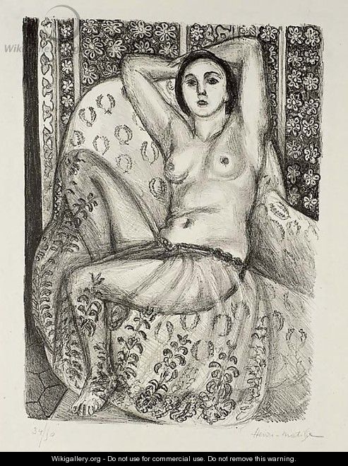
The clean, simple lines of his drawings and linocuts are easily overlooked I particularly like drawing Peaches and Leaves for the way you can see how he searched for the lines that pleased him. The way the drawings spill off the edge of the page e.g. Outamaro. I like the colour choice and the simplicity of the lines in The Window. The perspectives are slightly out of line but in a pleasing way, sometimes something slightly off of true screams at you and spoils the whole drawing/painting such as the left leg and foot in the otherwise brilliant Odalisque assise la Jupe de Tulle.
How do Elizabeth Blackadder and Henri Matisse differ? It's very difficult to generalise but Elizabeth Blackadder uses detail even in her more abstract paintings such as Still Life - Red Table with Chinese Teapot whereas Matisse's Dishes and Fruit although well observed, uses a broader brush to create an impression of the detail and looks different close up compared to the view from a distance. I can't define it but, when compared to Matisse, I feel that there is something more "modern" about Elizabeth Blackadder's work which could be identified without knowing who the artist was. Whether this is the quality of the colours of the paint or some sort of mindset derived from the ability to closely observe objects through the media of film or magnification I can't say.
I've not got Matisse's sense of pattern but I can understand his simplified, outlined forms. So I tried a very simplified sketch in my drawing book.

Rather than develop this I chose to use oil pastel on black paper. This is Version 1

The drop shaped bauble is actually clear glass but it would be too complex for the drawing I have in mind although I'm using it because I like the shape. I'm still aiming for over sized baubles. For this version I drew the white outlines first then added colour. I don't think the elements or the layout work and it's too simple. I'm aiming more for deceptively simple. So, Version 2

This was drawn in colour first then the white outline was added. It's a bit weak at the bottom right hand side but on the whole I'm happier with it.
No comments:
Post a Comment