

After I had studied it I was walking my dog and was struck by the similarity in layout to the leaves and branches of this tree.
I looked to see if any of her work was currently on display and discovered that I have seen Breathless a recent visit to the V&A but didn't realise who the artist was. The piece caught my eye because of the way it was presented, floating in a circular space, and because of the destructiveness of its creation which made me feel uncomfortable so I was interested to read that it has been a controversial installation. I also admired Stolen Thunder when it was exhibited in the 2014 RA Summer Exhibition. There is a subtle sense of humour and irony within much of her work which can coexist with more serious themes, the Poison and Antidote drawings were used in a project with Friends of the Earth.
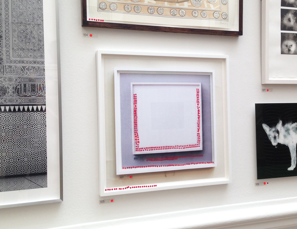
The Poison and Antidote drawings are delicate and beautiful though I wouldn't describe them as drawings. They are made from fairly large amounts of liquid which is allowed to spread in a similar way to the happy accident of watercolour so I would describe them more as paintings but I guess it matters less what you call them and more what they look like and represent. Could the drawings have been made without the addition of the poison and antidote? did their addiction to the ink cause it to behave differently? The lines of white on black are more delicate than I have seen in other Rorschach blots but I guess usually they are usually only done with a single colour.
To explore things further I decided to have a go at making my own copies (minus the poison and antidote!) I don't have Quink so I used black Pelican ink with white Winsor and Newton drawing ink on watercolour paper which has a machine made rough surface.

After making my own pictures I changed my view and decided that there is an element of drawing in the making of them. Although you apply random blobs of ink to stop the white and black just mixing into grey you have to control how they are positioned before the ink is squashed. I applied ink in one and two stages, black and white together, then black and white followed by additional white and a repeated fold. I also tried black Winsor and Newton ink to see if it behaved differently to the Quink (it didn't). The definition between the colours improved as the ink dried and made the lovely delicate feathery structures. If you look closely you will see that my pictures are not entirely symmetrical. I checked and neither are the originals although they are a lot closer and a lot more detailed. I wondered if the poison and antidote made the ink thicker and less inclined to mix to a uniform grey, then after I had finished I noticed that on the British Museum explanation it talks about correction fluid rather than white ink I would expect correction fluid to be more viscous than ink. The rough surface of my paper made interesting shapes as the ink spread, the originals are done on much smoother paper and don't seem to have this effect.

What do you think Parker is trying to do in her piece Poison and Antidote Drawing (2010)?
Her stated aim is to explore opposites and transformations, plus an interest in making "something physically dangerous" The use of poison is certainly a good way to make a potential audience sit up and take notice and the value of publicity cannot be underestimated but I see it also as a comment on good versus evil. The good white ink (Tippex?) versus the evil black ink working randomly and out of control. An underlying explanation that makes a visually pleasing piece of art have a meaning too. The shapes do look a bit like a snakes head, ready to pounce so there are layers of interpretation and potential meaning. Where does Friends of the Earth come into this? Do they see themselves as the good antidote working against the evil poisoners?
Poison and Antidote Drawing is created using rattlesnake venom and black ink, anti-venom and white ink. Parker often uses bits of her subject to make her artwork. Why do you think she does this?
There are limits to what you can do with traditional media. As I have explored in the last exercise the medium that is used to create a piece contributes to how that it is read. She is using rattlesnake venom to make something look like a snake, she is destroying instruments to make Breathless, they are flat and literally breathless. There is potential for further layers of meaning.
How do you think it feels to stand in the presence of artworks that are constructed from original objects of great cultural significance? How does that differ from, say, standing in front of a painting of the same object?
A painting is a 2 dimensional representation of something which has been filtered through the skill and intentions of the artist. The object, even if flattened, still retains some of it's solidity (unless it's graphene from an old master's drawing) Working from life rather than a photo is a more rounded, three dimensional experience and the resultant artwork is generally more lively and considered. This argument can be applied to something made from it's original. There is potential for a greater depth of meaning from such artworks if they are handled sensitively.
No comments:
Post a Comment