Wednesday, 29 April 2015

Project 3 Exercise 1 - Basic shapes

I've selected a number of drawings of different models sitting on stools as I don't have access to one for long enough to move around them.
 Watersoluble crayons. The foreshortening of the legs works for me but I'm not so sure about the arms particularly the one that is rested on the back of the chair.
 The head is too small and probably the body is too long. There is a distinct twist in the body and main area of foreshortening is the shoulders. There's a lack of depth here.
 She's not grounded on the floor so it's harder to see how her legs are positioned. The bent one is ok but the straight leg doesn't look as though the foot is closer to us although I'm sure it is. Again the head is a bit small.
 I love drawing this model as he's so lively. again the legs don't seem to recede away from you.
Same model, dynamic seated position. The foot looks closer to us in this one but the arm that rests on it lacks perspective.

Research point - Foreshortening

I looked through my sketches and found these examples, both done in coloured pencil on paper.
The feet here aren't huge but they are angled down from the model's position on the couch.
and here, the other way round the feet are tiny. 

This Pinterest page has some good examples of foreshortening and some of the images remind me of sculptures by Ron Mueck which is neither drawing or foreshortening but was maybe influenced by the paintings of Lucien Freud (it all gets a bit too convoluted) Foreshortening is a device used well in comics

Monday, 27 April 2015

Research Point

I sat down to watch the first episode of John Berger's "Ways of Seeing" and ended up watching all 4 in the series. It was fascinating on many levels. At the suggestion of my tutor I read his book Berger on Drawing, he is an engaging commentator with gentle but thought provoking style. The glimpse back into the 1970s was fascinating and he has lots of interesting things to say about Art and the way we view the world. Well worth a look. 
Looking at artists who have worked with the figure I started with Leonardo da Vinci who prepared the way for figure drawing as we know it with his anatomical studies.
Its hard to believe that Egon Schiele died in 1918. Sadly I missed the exhibition of his work last year, his work reminds me of the images that surrounded the punk movement, (obviously it should be the other way round)
Lucian Freud created nudes that were brutally honest but somehow beautiful too, I've referenced his work before for his dog paintings but I love his human figures too.
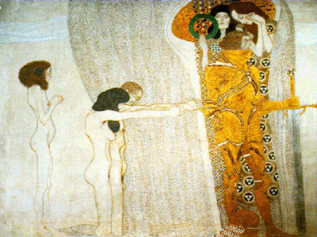
Although his work is very much about pattern Gustav Klimt relies on figures both to complement the patterned images and to give substance to the suggestion of fabric and clothing. 
I would love this book by William C. M. Cadenhead A Philsophy of Drawing The pages shown are so 
simple but beautifully drawn. 
Wil Freeborn is a contemporary illustrator who I discovered through the Urbansketchers group. Best known for his line and watercolour pictures of coffee shops in the Glasgow area he occasionally posts  beautiful figure drawings.

Exercise 2 - A longer study

The model was a girl with beautiful dyed purply red hair which contrasted with her purple clothes.
I used water-soluble crayons again...
I did a number of studies of this pose as she was comfortable. I'm pleased with them as I feel they capture the sense of calm contemplation. Looking back now I wonder whether the skirt was quite right, I have only suggested it so as not to dominate the body and face.

Sunday, 26 April 2015

Project 2 Exercise 1 - Quick studies

St Albans Art Society organise life drawing sessions in the winter so I'm using drawings that I did in these sessions for this part of the course. In a group of 30 people I'm not in the position to direct the model but I think the poses and the timed drawings are similar to what the course demands. These quick studies were done over a number of evenings using different models. Most of them were 1 or 2 minute poses.
 one minute poses with the model turning on the spot. Sepia conte.
 I ran out of paper so I continued onto this sheet
 A different evening and a different model. Also sepia conte.
This is my attempt to overlay the images. I find this really tricky as I get the individual figures mixed up so I used different colours of crayon for each pose. It was a bit feint so I've messed with the brightness and contrast on the computer. I'm sorry I read the instructions and it says don't use line.....

10 minute studies
Again using conte, using the side of the stick to suggest volume.
 I draw quite quickly so I had time to have a second go at the legs. I'm not happy with either attempt.
but I like this one.
This is Tombow marker. The main study took 10 minutes. I can't remember for the second sketch, it's not part of the exercise but I was being economical with paper....
Graphite stick
Brush and watercolour. 
I sit on the floor as there are tables that obscure the view and give me an excuse not to draw feet. You can see how this has changed my perspective in this drawing!
Charcoal
Charcoal and conte
Looking at my stack of drawings (not all scanned in!) I realise I tend to stick to conte or water-soluble crayons. I need to push myself to be more adventurous with media when the sessions restart in the autumn. All these drawings are on A3 paper, I find anything smaller makes me do cramped drawings and I can't handle bigger sheets. Some days the drawings work, some days I can't get it right but I find the experience both useful and strangely meditative.

Exercise 2 - Emphasising form with cloth

I'm a bit short of models at the moment so this had to be a self portrait. I started with water-soluble crayon at A3.
I chose too light a blue for this (this is the problem of working at night) so it's far too feint.
 I worked back into it with a darker blue but it's become a bit staid and forced. The brief didn't state materials or size so I did some further studies in my A4 sketchbook.
 The top drawing is in fineliner but the one I had was drying out and the cat chose that moment to sit on my lap so I had another go in coloured pencils trying to be bolder with the colours
Then biro, I got a bit carried away drawing my face. It's nice to experiment when your model is not going to complain that you've made them look old/ugly/fat etc.
The problem with a clothed figure is when the fabric lies in a way that doesn't appear to relate to the figure underneath or when it looks as though it is part of the underlying figure in a way that is not possible. Having said that I've done a lot of life drawing and I find a clothed figure more interesting in that the clothing says so much about the person beneath.

Saturday, 25 April 2015

Part 4 Exercise 1 - Drawing fabric using line and tone

One sketch focusing on line the other on tone.
Two attempts, changing the way the fabric hangs for the second attempt. The first is coloured pencil for tone and felt tip for line.
 The second is coloured pencil for tone and dip pen and ink for line.
 Five minute sketches of different areas of fabric using different media
and then an unscheduled drawing of the whole thing using graphite stick because I wanted to test it out on a larger scale.