Sunday, 21 August 2016

Suggested research.

My tutor suggested that I looked at the work of Tony Orrico and Heather Hansen who make very large abstract drawings as performance art. The drawings are very similar because they are setting themselves similar criteria for their execution though Heather Hansen seems to use only a thick dark charcoal and uses smudging and smearing as part of the drawing process. I think that the value of the work is very much in the performance itself. I find her easier to watch than Tony Orrico, she is graceful and seems relaxed. He is precise and measured but looks uncomfortable at times and that tension disturbs me. I like the effect of the more fractured line in some of his finished drawings. Particularly Impressions Penwald: 10: seated quartet  and Icon of absence 

It takes a very different type of artist to make their work in such a public manner, more of a dancer. The work is very physical, and enormously serious in the videos that I watched, like an athlete or someone undergoing a religious ceremony. Where do the finished drawings go? Beautiful though they are there are very few places that could hang them, is the aim to make something that is displayed as a photograph or print?

Whilst doing some general research I came across the body prints of David Hammons This is both similar to the work of the artists above, but also completely different. I've not seen anyone doing anything even remotely similar. Is that because the technique is limited? Hammons prints are like early photographs in smudgy black and white tints. Occasionally simple colour.

Anna Theresa De Keersmaeker  concentrates on the dance and performance and her drawings only makes a drawing appear in the sand that is laid beneath almost as an afterthought. Her performance is more lighthearted and there is a childlike quality in the apparent enjoyment.  She talks of simple movements and references the way that a child dances. She also feels that the space in which the performance is made changes its nature, the Tate Modern is neither a traditional dark theatre space nor the white sterile canvas of a museum or art gallery. Does Picasso's comment "It took me four years to paint like Raphael, but a lifetime to paint like a child." apply to dance?

It looked interesting, I had to try it for myself.

My first problem was the size of paper needed. Fortunately son number 2 has just had some bike bits delivered in a big box. It still wasn't big enough but if I contained myself it was ok for an experiment and it had the advantage of being thick enough to use in the back garden without blowing away or rucking up.

I placed the sheets like this and sat in the junction of all three to hold them down.

As a nod to Assignment 3 I played Holst's Mars the Bringer of War though this isn't my work, just an exercise. I felt it was part of getting into the process. It's a lot harder than it looks. You have to work to make both hands follow the same line and you need a clear idea of what movements are acceptable and what aren't otherwise you end up with scribbles as I have here

In my defence the edges of the box did throw me off line at times too but even without them I would not have achieved consistent lines.


This part, the box in front of me, was the best drawing and most like the lines that Tony Orrico and Heather Hansen make.
Using what I learned with my first attempt I turned the boxes over and arranged them around me. I made sweeping strokes keeping my elbows locked and turned on the spot, sitting in the middle. I didn't manage to keep the boxes still for the whole of the drawing and would need to tape them down to be more accurate but I did make a reasonable circle. 

I used graphite sticks which weren't the same size. To do this properly it would help to have identical sized mark making materials. I would also need to work on the strength and coordination of my non dominant hand which got quite tired holding the graphite. 
Tony Orrico does a drawing turning on his knees and turning on the spot which takes up much less space so I tried this with a piece of A1 paper a red coloured pencil and a multicoloured pencil. Neither of the artists seem to use colour and I liked the idea of a sun image made this way.
Soft coloured pencils make nice bold marks but need sharpening regularly 


It needed more depth colour so I repeated the exercise over the same drawing using yellow oil pastel. This lead me to wonder about spinning a la Anne Therese De Keersmaeker in the middle of the drawing.
First I tried wedging the oil pastel between my toes.
But it worked better when they were held like this. It's a dodgy exercise in my front room but I made this mark.
Which makes the finished drawing look like a fried egg!

I find this sort of exercise makes me understand the concept so much better. I guess it's why in the past artists were set to copy an old master. I have a greater respect for Tony Orrico and Heather Hansen having done this. It looks simple but it requires planning and discipline to execute successfully especially as a performance. It would be great to try a full drawing lying down on a full sized piece of paper - as long as there was nobody there to film me.

Monday, 15 August 2016

Assignment 3

The brief calls for a drawing movements in response to a rhythmically complex piece of music. I chose Holst, The Planets and started on a A2 sheet of sugar paper using pastels.
The red and purple masks represent deeper, louder notes, the blue and yellow higher, quieter notes. This took considerably less than an hour to make but the shapes of the marks quickly became lost in the mass of lines. I do actually quite like it, it's bold and lively and not like anything I would normally draw.
In an attempt to draw for longer without creating a tangle of lines I changed to coloured pencils.


My photo is a bit out of focus but you get the drift. It's still a bit scribbly

So I drew over it with pastel, one on each hand in time to the music. I should have checked the colours better before I started, in the manner of pastel they were a bit grubby on the outside.

I closed my eyes and in homage to Rauschenberg I used a putty rubber in each hand to erase in time with the music. It smeared some of the pastel rather than removing it all.

Then added more pastel over the top which sort of works.

 I decided to just draw in response to Mars, The Bringer of War as the rhythm although still complex was more consistent.

For this drawing I closed my eyes throughout and was surprised how clumped together the marks were even though I thought I was using the whole page. I had hoped that I might repeat lines over each other but there is little evidence of it.

So to make it more interesting I closed my eyes again and used charcoal to the sounds of Jupiter, The Bringer of Jollity which is a much more choppy rhythm.

I put everything to one side then reviewed the drawings a couple of days later. I can see a face in the second drawing, well several faces but this one is the one I chose to highlight.

I accentuated some of the lines around him, could he be posing or lifting? He does have a flat cap so he looks more like someone from Manchester or Jarrow rather than Mars or Jupiter
I used white pastel to highlight the swirling lines as though he has been blown in from a cartoon. Maybe more genie than greengrocer now.
Here it is with the photo tidied up a bit.

I think I preferred it with just the dark blue lines although the white does change the way that you read the drawing.

The aim of this brief is to explore the interplay between gesture and representation.

The OED says;
Gesture  "a movement of part of the body, especially a hand or the head, to express an idea or meaning."
Representation "The description or portrayal of someone or something in a particular way"

The marks represent my physical response to the music but the representation is very much a personal internal thing which is made public by the act of drawing it. I can only represent myself so although I may produce something that is visually appealing I don't think anyone else can share that feeling or identify what I was listening to from looking at my drawings. The technique has potential to generate new marks and ideas and set the mood for a picture. It forced me to work large and loosely and not be over reliant on likeness and making a "good" drawing.

Reflection Part 3
This part of the course really pushes the definition of drawing out from the norm. It lays down a challenge to step out of your comfort zone and abandon safe representational drawings. I enjoy the experimental aspects but it is hard to reconcile the work I have done here with my own self-generated work, I guess that the parallel project is where this should come together. I don’t think that someone looking at my coursework here would recognise it as mine so I have abandoned whatever could be considered my emerging personal voice in my experiments but I do think that this is a good thing. I have been working in the same way for too long and have created a net of what is acceptable and “good” which imprisons creativity I need to try different approaches to move forward.

For the final assignment I am still working too small but I am struggling to fit larger pieces of paper into my house to work freely on, I need more space. I looked at Tony Orrico and Heather Hansen after doing my final pieces which was a mistake as I think that they would have informed the work.

The drawing machines worked best for me. There is a lot of potential to produce different work and add to the drawings generated in that section. I am also reasonably pleased with the finished pieces for the final assignment. I am learning to keep working into unpromising drawings, because I consider them to have “failed” I am not too precious with them and I have found that they can only improve. Using very long implements to draw was challenging but does make lovely relaxed sweeping lines and counteracts my annoying tendency to scribble. I used this technique to make a drawing for my parallel project.


The blind drawings weren’t as successful, as finished pieces. I’m a very visual person and I find it hard when I have to use my other senses. Blind contour drawing is a skill that needs practice, that’s another thing I should add to my to do list. I do think that it’s a good technique to try to loosen up or deal with creative block and it does make me think differently about how I represent objects.

Saturday, 13 August 2016

Contextual focus Point - Erased De Kooning Drawing and Stephen Marshall


Erased De Kooning drawing by Robert Rauschenberg. It's marketed as a blank sheet of paper but there are soft ghostly traces of the original. It's an artwork which requires you to stop and look and think, not something that you can just glance at and tick off as having seen it. There are parallels with Cornelia Parkers Room for Margins installation which must have been influenced by Rauschenberg. San Francisco's Museum of Modern Art made a digitally enhanced infra-red scan which is an interesting idea but maybe misses the whole point of the original? Robert Krulgich has an interesting explanation comparing the drawing to the "nothingness" of space which although it looks black and empty isn't nothingness at all.The importance and success of the drawing owes a lot to the story that Rauschenberg created around it and this was something that he was clearly very aware of embellishing the story as the years went on. Sarah Roberts essay discusses the history and mythology which surrounds it and her clear description and analysis make a lot of the discussions available online feel lightweight.

The success of the project depended on De Kooning as much as Rauschenberg, he played along with the game, not only by providing the original but but staying quiet as the story grew, and becoming involved giving intermittent soundbites to keep the ball rolling.

The course notes suggest that there are interviews online with both Rauschenberg and De Kooning but so far I have only managed to find this interview from the SFMOMA website. I have been watching this video which is rather long (I'm not good at just watching) and so far has just proved to me that Rauschenberg was very difficult to follow and understand when he was younger, I need to concentrate harder.

Overall I think that the Erased De Kooning is an interesting and novel concept presented in a clever way. It also appears to be unique, I haven't seen evidence of anyone copying the idea.

Stephen Marshall is a very difficult character to track down. (I wasted a lot of time chasing Steven Marshall who is only slightly less elusive) Stephen Marshall's website seems to just show one of two  a randomly chosen pictures. He has done a collaborative project with Tim Dodds which involved swapping drawings and working on each others work. The Saachi Gallery has a number of his works which seem to be characterised by having a three dimensional element, Glory Fruit Five Trees Penblwydd Hapus appears to fool the eye into thinking that you are looking into the angled board to create an illusion of three dimensions. The Dead Sea The Cool Mist Hikers Getting Hit by Lightning is a complex piece which I think needs to be seen in the flesh to be appreciated. Is this what the course notes mean about a fluidity of drawing? They look like enlarged sketchbook works which happen to have found their way into an exhibition. His work inhabits an area between figurative and abstraction there are ethnic influences and the work has a naive quality. I think it's a little too naive for my taste but I haven't seen it in real life so I'm not really qualified to comment. Of the work I can find I like No good boyo one two which is blessed with a mercifully short title compared to his other works. It's a lot simpler than the other paintings so it's easier to read as an online photo. I like the tension between the two figures, what are they about to do? what happens next?

Monday, 1 August 2016

Project 4: An emotional response


The brief calls for 10 characteristics of someone found in a novel or newspaper article. 
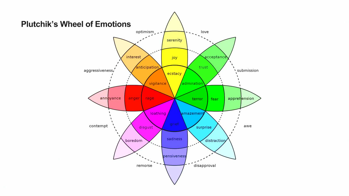
They are supposed to be written by other people but I want  a good range of emotions and doubt that I will be able to adequately explain the idea to my scientific and literal friends and family. I looked at the range of emotions and found this info graphic.
Instead I used items from the news and magazines.

  1. I think people in this country have had enough of experts.
  2. I never forgot about the girl I used to be.
  3. I crave freedom and creativity more than stability and security.
  4. I don't want him to suffer.
  5. I'm so tired I never want to wake up again.
  6. I am weird, weird is good. 
  7. I did not kill my daughter.
  8. I am a sunday morning inside 4 walls with clean blood and organised drawers.
  9. I am the hurricane setting fire to the forests at night when no one else is alive or awake.
  10. I saw people die every day in the camp as a result of hunger and poor nutrition.

I compared them to the emotions on the wheel and decided that the range of evoked emotions was too complex to neatly fit into the categories but I could loosely apply all 8 stem categories so I am happy that I have a wide range to work from.

The range of emotions makes it difficult to imagine a coherent drawing but maybe that's what the brief is looking for. I prefer to use myself as a model because it leaves me free to be as expressive and unflattering as I like. I shuffled my cards and set the timer on my phone for 10 minutes, resetting every time I picked a new card. I used a small mirror thinking at the start that I would draw myself piecemeal but found that impossible if I wanted to capture emotion at the same time so I used my imagination a bit because I wanted views that were difficult to get in the mirror.

I'm not sure that mixed media was the best idea but I was trying to use the medium to convey emotion. I think that there might be a better way of doing this. I divided the paper into 10 segments and loosely drew a seated figure then drew a section randomly assigned to a statement using pink, green, purple and ochre crayons. The style of drawing was dictated by my emotional response to the statement and I blended the edges slightly but the differences are too stark. 


If I'm being charitable I could say that there are similarities to Peter Blake's Self Portrait with Badges but I whilst I like a lot of Peter Blake's work I'm not fond of that picture, it's too symmetrical and static. I think that the  finished picture looks like something from a children's game or cheap picture book.

Reflection


To what extent did your emotional and physical responses fuse? 
In the first drawing I felt much more emotionally engaged. I think that this was in part because I hadn't set myself too many boundaries, and partly because the statements were reasonably fresh to me. Because my only boundaries were the edges of the paper and the materials available to me I could be more physical with my gestures. Ten statements are a lot of emotions and there is inevitably a degree of repetition. Maybe the idea of this is to steep the student in a soup of emotions but emotions become dulled by repetition.


Did this change as you progressed with the exercise? 
In the second drawing my responses had been dulled by familiarity. I would like to do this exercise with statements that I hadn't heard before.


Did you find yourself able to respond emotionally and physically at one and the same time? 
I think I need more space for a single emotion to really engage with the physicality of drawing in response to it.

Feedback

Both my tutor and I agreed that I haven't released the potential in this project. After discussions I felt that the graphic animation style of William Kentridge could be used to animate the work. Technically this was challenging, I have only my phone to film with and I had trouble mounting it so that it could see what I was doing so please excuse the quality of this film. 


It was very much an experiment and I need to think about whether I should plan what I draw or edit the finished film as well as working out how to better film what I am actually drawing but this might have a place in future projects or could be something worth returning to.

Tuesday, 28 June 2016

Drawing machines


Find something which moves and attach a drawing medium to it so that it creates a drawing by itself. 
A felt tip attached to clockwork chattering teeth. I did start with charcoal which made more curving lines of short choppy marks but sadly they didn't show up well. The felt tip makes the same small lines but tends to just move forward.

Looking at some examples of other drawing machines. Using motors and robots. The DuoGraph which is a new more sophisticated take on the Spirograph from my childhood, and often more figurative work from Harvey Moon who has some interesting projects such as the drawing controlled by the cricket. I was inspired to try and construct my own machine. I tried deconstructing another clockwork toy but couldn't attach a pen to make a mark. I explored rubber bands and cardboard and spinning pens which didn't really work. Suspended pens did make a mark which curves nicely in between short lines and dots.
Hanging the paper seemed a good idea but the weight of the pen stopped both pen and board from moving independently. I filled a plastic bag with slightly diluted gouache and made a pin hole to use suspended instead of the pen but the paint fell in drops rather than a steam. I'm sure it's possible to fix but it could take a lot of time.

My first thought when I read the brief "You might use a remote control car, a clock face, a door which is opened regularly, the foot of a dancer." was to use the trace of an ice skaters blade on the ice.

It's hard to see what you're photographing as the light reflects off the ice which adds an element of uncertainty to the exercise. I took 6 photos of an area where I had been practicing spins. It's not very clear at first but with a bit of Photoshop intervention I think you can see what is happening.
Incidentally the reflection of light in the ice makes an interesting pattern when the photo is inverted.

Using the trace of my skate on the ice as the basis for my developed piece and started by printing the photo at A4 size and tracing the lines
Then I drew it again in multicoloured pencil 
Which is a bit dull so I tried some big sweeping drawings in pastel 


Then carefully copied the shape and added some coloured pencil
This has the feel of a Charles Rennie Mackintosh flower but I'm actually seeing big hats on a sunny day, Ladies Day at Ascot. Its not a design that is easy to repeat so instead of thumbnails I printed out some copies and tried colour using crayons.


They are a bit feint but I like the bottom version best, particularly the purple lines which feel like movement (this happened accidentally as I scribbled in colour).
I copied the design onto a larger sheet of sugar paper and added colour. It was, surprisingly, easier to make smooth pencil curves on a larger drawing.

The colours are a bit bright but I wanted the feel of well cared for green grass and extravagant hats on a sunny day, maybe I'm trying to be too specific and not letting my audience make up their own minds. I don't like the purple lines in this larger drawing. Everything else is smooth and the lined area looks unfinished.
Removing the lines makes the purple area look like a flat balloon but I think its the contrast with the white.

This is a little bit better but removing one area of white makes the other look odd and unbalances the picture.
Now its too pink and I've drawn the life out of it. The rough had more energy and potential so I strengthened the colour and used a little water to soften the green of the background.
At this point I told myself to stop and move onto the next task, but just one more version.....
White on a neutral background suits me well, but it needed some colour.
This time I resisted bright colours and went for green grass and sunshine yellow maybe inspired by John276778 who posted a photo of scattered yellow flowers on the Personal Voice thread in the Coffee Shop forum.

It's difficult to preserve the energy of the original lines once you start to draw them carefully and the temptation is to tidy the original. However it is nice to have the freedom to remove splodges and random lines that don't fit with my vision of the design. Having an automatically generated original to work from frees me to make something different to my normal style. I do prefer the lines that I drew myself because I am a bit of a control freak when it comes to my own artwork!

After I'd finished I found this video of drawing machines made by Fine Art students at Batley School of Art and Design which shows them successfully doing what I failed to achieve with my clockwork toys.

Research
Rebecca Horn Projects include Activation Real Time The machine creates a simple movement which is repeated inaccurately so that the marks overlay each other. It is complex because it is repeated many times but simple because the machine is unable to do more than a few types of movement so the marks are similar. The piece is better explained here I also managed to find this video of some of her machines. I don't think that I haven't found links to all her work although I checked all the libraries and galleries on the student website.

Her machines are artworks in their own right, clever interesting and thought provoking, but I don't see them as drawing machines apart from Activation Real Time or the machine that dips into the water towards the end of the second video. I guess the machines draw invisible lines through the air but surely to call them drawing machines complicates the description and takes attention away from what they do well which is to bridge the gap between humans and machines. I think she is exploring how a machine can be made to be vulnerable yet able to perform to an audience in a gallery. By doing this she is exploring how humans function.