Thursday, 26 March 2015

Exercise 4 - Statues

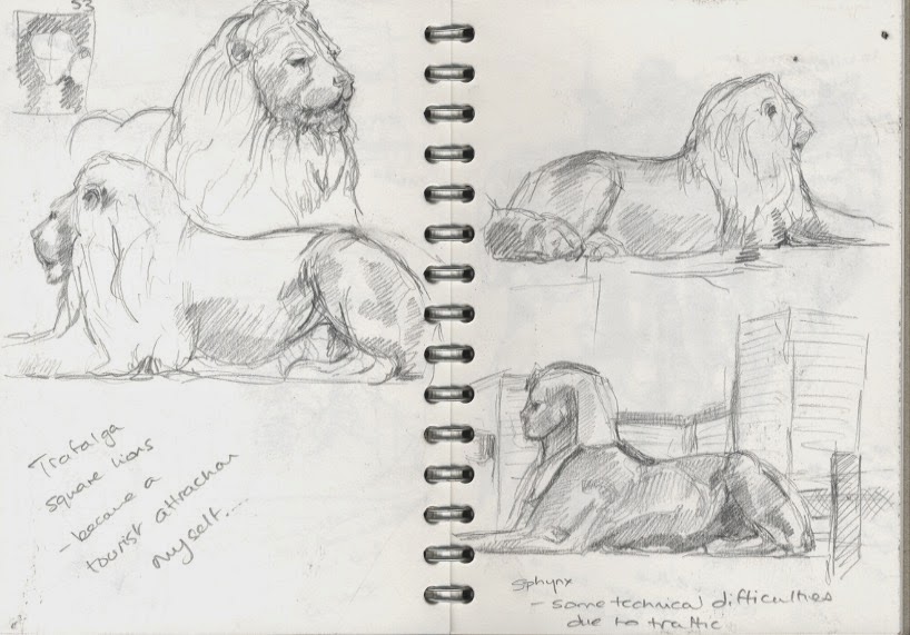
Back to something more in my comfort zone, though I'm still not comfortable drawing in public. I was in London to see the John Singer Sargent exhibition so the lions in Trafalgar Square were an obvious choice.

Inadvertently I became a tourist attraction in my own right when a lovely lady from group of (possibly Japanese?) schoolchildren spotted me. She positioned herself beside me to watch and waved the children from the group away when she thought they might obstruct my view. When they went I moved down to the Embankment and drew one of the Sphinx from across the road which was technically difficult when the buses stopped in the traffic and blocked my view.


The drawing on the left is in a sort of alcove opposite the Sphinx and was presented by the people of Belgium after the 1914/18 war. They are more contemporary and were holding some sort of foliage or fabric, I'm not sure what it signifies. Here is a link to a photo taken from the front (I drew from the side) This site states that they are holding garlands but they look a bit big for garlands to me. The drawing on the right is Lawrence Olivier and suffered from the fact that I was getting cold...

I found myself back on the Embankment again yesterday so I drew the Frank Dobson sculpture London Pride. I was attracted to the way the sculpture was part of the crowd. Children sat on the figures laps (but disappeared when I sat down to draw) and passers by touched, patted or stroked the figures without stopping or breaking stride.
I found it harder to draw the distorted figures, my pen wanted to make them "normal"

John Singer Sargent exhibition National Portrait Gallery.

See the National Portrait Galleries Website. 
His portraits are great but his drawings are my absolute favourites, particularly Gabriel Faure and Mrs Patrick Campbell (charcoal and pencil on paper) and Dame Ethel Mary Smith (black chalk paper) lovely confident sweeping lines.
Some of my notes from the exhibition. (the top left are skies drawn while I waited for my train which snuck in...) Vernon Lee was probably my favourite portrait, a lady of obvious character and I loved the way he hinted at her glasses with just a touch of paint. I tried to study his compositions which are an area I struggle with. His paintings are interesting for what the leave out (faces, features) as much as what they include.

Exercise 3 - A limited palette study

Inadvertently I've done this exercise with the last drawing but I thought I ought to do it consciously so I went back to the drawing of the community centre and pub.
Charcoal and conte on A3 looks a bit fuzzy
I tried being looser with my marks
and then I drew in graphite pencil, added colour with green and sepia coloured pencils then highlighted with a fineliner.
Better cropped maybe?
There was energy in the original drawing which got lost in this piece. The composition seems dull now. I tried repositioning it on the page.
The first 2 attempts look better as scanned images than they doing real life so I worked into them, added some skies and cropped them.


The top one is better, the bottom may benefit from a night sky?
Maybe a different medium? Dip pen and ink (black, green and brown) the a touch of green and brown crayon for the grass and the sky.
Ultimately I think that despite the promise of the initial drawing the scene is pretty dull.  A more oblique angle would have been better, the fact that the buildings are straight on is dull. For this exercise I still feel that the drawing from the previous exercise was the best.

Sunday, 15 March 2015

Exercise 2 - Study of a townscape using line

For this drawing I took my car to an adjoining road and drew the back of my row of houses.
I've drawn them before from my garden so it was nice to take a different view.
 The perspectives are all wrong here so I started again....
This is better but the new flats aren't at the right angle. 
While I was out I though I should try some other views so I drew the community centre and the pub from both sides.

I'm interested in the contrast between the new flats and the old houses in my first drawings so that was what I returned to to do my pen and ink drawing back at home.
I did a couple of feint lines in pencil to try and ground the perspective then drew straight in ink with a dip pen using just my drawings for reference. It's more accurate than my previous attempts but it's a bit dull and stilted, more like an architectural drawing than a piece of art. Also the shading on the wall of the left hand cottage is a bit too dark, the first line came out stronger than I intended so I had to go with it. I've intentionally left the cars as outlines as I don't want them to be the focus of attention though I think they are an essential part of the composition.
The instructions do include the option to use a fine brush pen so I diluted some black ink and added some softer shadows.
The paper isn't really designed to take wet media but I think the overall effect is more coherent.
However I couldn't resist fiddling further so I added a little sepia coloured pencil and used graphite to further darken some of the greys.
I need to test whether I'm right to leave the cars as outlines.
Difficult. I think this is worse but I used 5B pencil to colour them in and it's not great however I didn't have a lot of information to base coloured versions on.

Overall I think the final drawing is unexciting and this is in part because I've worked from my preliminary sketches so the information has been diluted by repeating the drawing. I can't say there wasn't enough information for the final drawing in there original sketches, but I think I have sanitised it. I don't draw well in the car and I can't imagine using ink with a dip pen without covering everything in ink but I think an original drawing in ink would be better than a copy so ideally I would always prefer to draw directly from life.

Exercise 1 - Sketchbook of townscape drawings

The problem here is that there is so much choice I don't know what to draw. My only limitations that its too cold (or I'm too pathetic) to sit outside, so it has to be something I can draw from inside, and my car is my most convenient studio.
I ended up in the car park of a park I've know since I was a child. There is a grand old cricket pavilion which was refurbished some time in the 1990's but is starting to look a little shabby again.
I started with the sunken doorway, then an overview. It was cold and grey and the light was very flat, no shadows to speak of. There are some nice decorative tiles that run around the building between the ground floor and the second floor, and decorative ironwork on the side of the stands.
I became interested in the view through the windows looking at the decorative ironwork that supports the roof.
At home I tried to draw big and bold, but my lines curve when I draw so large.
This is charcoal, conte, Aquarelle, sepia ink and white oil pastel. I don't like it because the lines are too curvy so I went back to A4 sized blue paper.
This is pencil, conte and Aquarelle. I've lost the detail of the interior ironwork but I like the door. Unintentionally this is very similar to the work of Peter Rush who is an Australian artist I admire. He draws on the inside of cereal boxes, though his compositions more interesting and his drawings are bolder. Reassuringly I note that his lines aren't super straight either!

Research point - The urban environment

I looked at the work of Whistler His foggy and night scenes are inspired and it's good to see some of his preparatory studies. (His figures and portraits are great too) He was a contemporary of Monet who also painted moody London scenes but my favourite urban painting from him is Street of the Bavolle Honfleur, from 1864 which draws you down the street.

When I was thinking about artists who work in series with the landscape I looked at John Virtue but at that stage I wasn't aware that he had been an associate artist with the National Gallery (this is a good website with insight into how he works). I like his abstract landscapes but I'm struggling with Landscape No 507 which either has a man on a unicycle or a face leaping out at me.

John Dolan has been in the news recently. He draws the urban landscape around Shoreditch in London, simple yet detailed, his work reflects the many hours he spent observing the environment around him.

I have been a follower of the Urbansketchers blog for a long time. It showcases the work of a number of invited artists from around the world, not just urban landscapes but often people too. I'm always impressed by the variety of styles, subject matter and approaches from the correspondents. Recently there have been fewer posts but they are still worth following. I particularly like it when the subject matter is ordinary, everyday, and not obviously something worth drawing. It's good to see someone draw attention to something that is beautiful and interesting but overlooked.

While researching self portrait painting I came across this lovely atmospheric painting by Van Gogh which I had never seen before.

David Tress is best known for his rural landscapes but I like his urban work equally. He manages to combine realism (I can see the landscape that he bases his painting on) with abstraction. The end result is a painting that looks like a real scene half glimpsed on a sunny day. It somehow mages to be more realistic than realism. Brilliant stuff.

Sunday, 8 March 2015

Exercise 3 - Aerial or atmospheric perspective

I started with the view from my upstairs front room again but positioned myself the corner of the room so that I had a view down the street.
As well as working on atmospheric perspective I wanted to work again on linear perspective. It's sort of successful but the tones are probably too similar. Maybe colour would be easier?

 This is coloured pencil and graphitint pencils. They're very soft so I had some difficulty establishing sharp lines in the foreground. It's a bit better in real life.....
I tried charcoal for a view down the garden but this really didn't work.
Although it improves slightly if cropped
Or biro and coloured pencil

I think my second attempt was the best