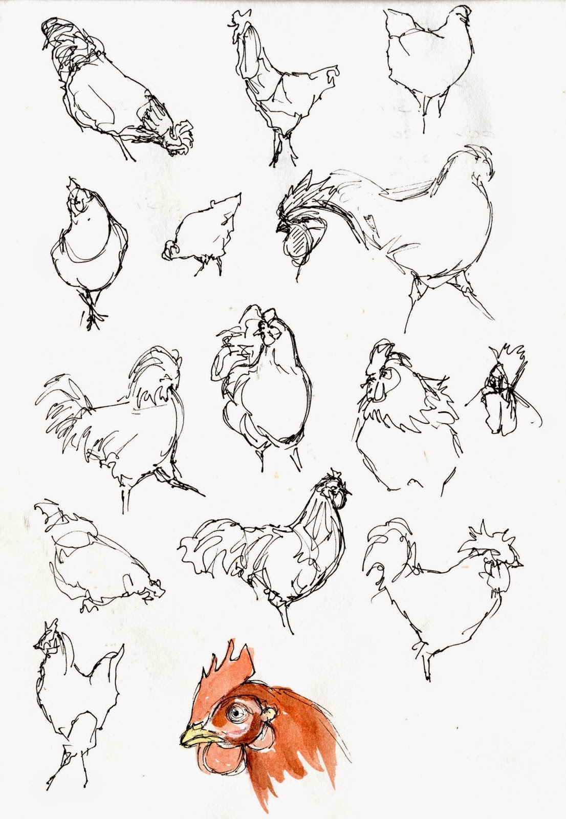
This is an excuse to draw chickens...
lots of chickens
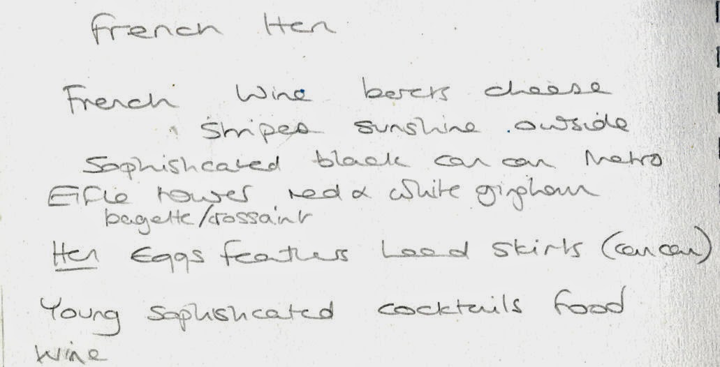
but there's more to the French Hen than chickens,
so maybe some cocktails?
I have tried to research similar venues but few of the places I have identified so far have a logo.
There is The Function Rooms in Hemel Hempstead
I like this from Jodie Lee Designs
More sketchbook ideas
Which could lead to
I downloaded the Paris Metro font, I know its cheesy but I couldn't resist
Going off at a slight tangent
My photography skills aren't up to developing this one
I do like the chicken
but I think it needs to be more French. Maran hens have black and white stripy feathers and red combs
This is by Josephine Broekhuizen
The stereotypical view of French dress is stripy black and white top and a red beret
More chickens
I like the top 2 hens but their heads are wrong.
While I quite like the idea of my hen waiting at table I haven't got the image right and I want to avoid direct references to drinking
I printed my favourite 2 out and tried different approaches. I think the effect of all of them together is pretty good.
These are the best 2. I think the chap on the right is the best but I'm not sure he should be looking at his feet. I know that they are hens but would they make sense to someone who hasn't followed my design process?
I think the feathers are the most successful design but not like this
What about multiple feathers?
or maybe just keeping it simple
In the bar this is how it could look
Menu and beermat (bit of a wobbly hand taking the photo with my phone, can anyone recommend an image stabilising app for an iphone 4?)
Either as a small emblem on the T shirt or a larger logo
and similarly for the napkin
In contrast to the last exercise, although I found it hard to get started I really enjoyed this project and I' m much happier with the results
What about multiple feathers?
or maybe just keeping it simple
Menu and beermat (bit of a wobbly hand taking the photo with my phone, can anyone recommend an image stabilising app for an iphone 4?)
Either as a small emblem on the T shirt or a larger logo
and similarly for the napkin


No comments:
Post a Comment