Saturday, 28 February 2015

Exercise 1 - Developing your studies

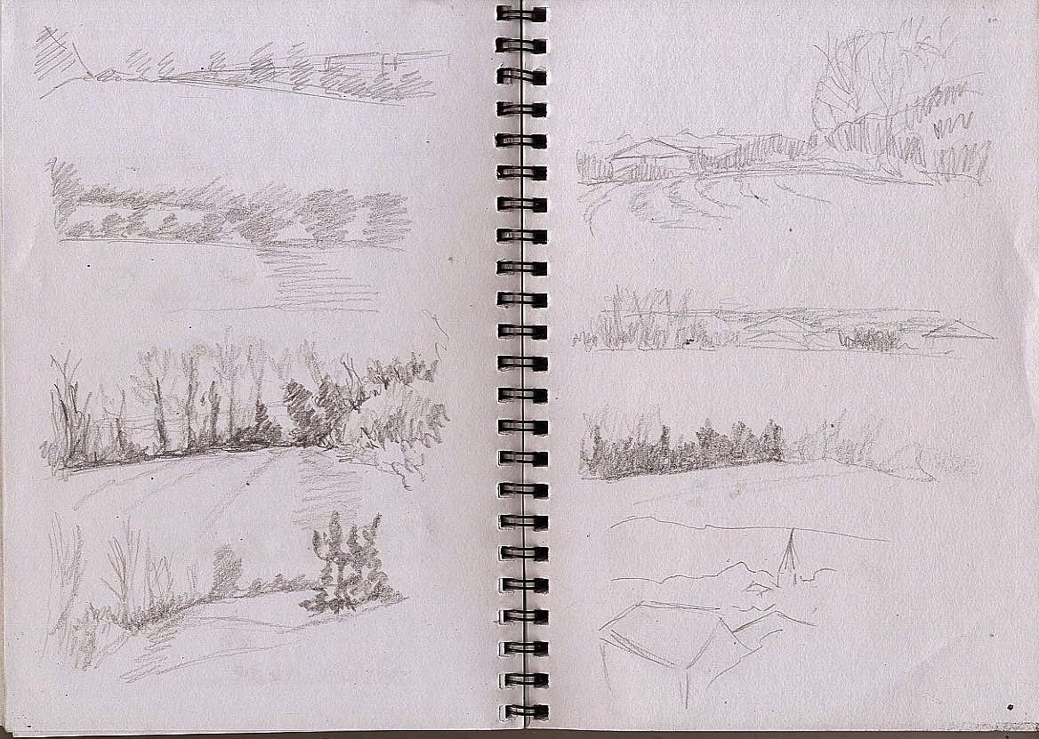
I'm not particularly excited by any of my studies so far, I find landscapes very challenging. I went back to my reference photos and did some more pencil sketches.
I think the top right and the third on the left are the most promising, but I'm also not finished with the view down the hill from the last exercise. Applying the composition techniques from the last research point I get this
Which I drew with Aquatone sticks and applied a little water
Its not very exciting and I don't like the bush on the right hand side.
Maybe better cropped? It has a very 1920's feel but I think its just boring
 Some more studies using Aquatone sticks

 and with Tombow markers
Not as good as the preliminary sketches. I tried again with markers and used water to loosen the marks. The paper is rather small so I worked at an angle

This is a technique I've tried before but I think this time it's a bit of a mess. How about charcoal?
It lacks definition, too hesitant with the shades of grey. Lets try and be bolder. I went back to my earlier drawing from the 360 degree studies which is the only drawing I've been reasonably happy with.

I smeared my paper with blue pastel for the sky then drew the trees with charcoal.
I like this better but I'm worried I haven't added anything much to the original photo and only colour to the drawing. It also doesn't conform to the rules of composition apart from the horizon being about 1/3 of the way up the paper .

Friday, 27 February 2015

Research point - Composition

I've never understood the golden ratio this video has quite a good explanation. I think I understand it better when explained as a Fibonacci Sequence and trying it out on squared paper helped
The Rule of Thirds advocates subdividing an image into 9 equal parts and placing important features on the lines that are created. This is linked to the Fibonacci sequence in that the squares are roughly 1/3rds e.g. the blue square is 5x5, the purple square 3x3 and the green square 8x8 1/3 of 8 is 2.666 recurring and 2/3 are 5.333 recurring.
Wikipedia has a good summary of some theories of composition. Layout on the page and use of line tone and contrast makes the viewer read the image as the artist desires. The viewer prefers to see an important object surrounded by an even number of other objects (the Rule of Odds) and to be lead around the picture. A static image is less appealing, we like to let our eyes wander and search for items of interest.

Thursday, 26 February 2015

The Art of the Brick

It's not unintellectual exhibition, but who doesn't love making things with Lego? You have to be impressed that Nathan Sawaya was bold enough to get out there and make a living out of Lego modelling before the rest of us knew it was possible. Where he differs from many artists is that he mixes in inspirational quotes, he is an ex lawyer, a man who understands the power of words. Who doesn't want to read that quitting his job in law to make art made him happy or that art makes better people. The quotes are part of the experience of the exhibition. 

Research point - Artists working in series with the landscape

What does making art in a series mean? Art business has a good explanation here

Anna Dillon has done many landscape paintings which she groups into series by English Counties such as Oxfordshire. Her style is very simplified and colourful, but stops short of becoming a cartoon of the landscape. Theres a sort of 1920's feel about them, reminiscent of the lovely posters for the underground. Nicholas Herbert takes things to the other extreme with paintings that merely suggest the landscape that inspired them, more Turner influenced

There is a nice piece with illustrations here from the Metropolitan Museum of Art which documents the work of Monet who painted Paris and the Normandy landscape. I also found a link which collects together 40 paintings by Cezanne. I do like Cezanne and he does keep cropping up in my research.

Much has been made of David Hockney's series of landscape paintings of Yorkshire but I prefer his earlier work Bolton Junction Eccleshill or Moorside Road Fagley. The paintings I prefer combine reality (the houses look like houses) with simplicity, blocks of colour, loose lines and human figures that are sketchy enough to look like they have been caught in movement. I've just watched an interesting documentary on BBC 2 which shows some of his paintings of the same trees at different times. Shown sequentially they make more sense to me than they did looking at them individually online This is the link though it only works until 20th March 2015

Peter Doig's Pond Life and Cobourg 3 are part of a series of cold themed landscapes although he has done other warmer pictures such as Pelican. Pond life's my favourite it is deceptively simple but there is so much going on. The colour palette is lively, not too realistic but not too bizarre or harsh, and there are figures in there too to add interest.

John Virtue paints semi abstract pictures which are based on real places. They are usually in black and white although there are some coloured paintings shown in this collection from the BBC. I admire the way he can be so loose and abstract but still somehow figurative. It's also nice to see someone successfully working without colour. There are some nice big skies in there too, I particularly like View of Green Haworth from the North.

Sunday, 22 February 2015

Exercise 3 - 360 degree studies

Hemel Hempstead has been listed as the grottiest town in the UK which is a little unfair as like all towns it has it's good and bad points. There is a view which I see when I walk my dog which I think is rather fine. Sadly I'm no photographer and although I've tried to draw it before I've never done it justice. With this in mind I took some photos when I was out walking this morning, I know is should have braved the elements and drawn in situ but it's still pretty cold and there was a hard frost. My lack of dedication prevents me from becoming a landscape artist....
 I thought this was the dullest view but actually I think it was my most successful drawing.


 This is the view though I've drawn it from further down the hill as I couldn't make sense of the jumble of houses. There is still too much information in this view and I can't make sense of it so I tried using colour.
 and then biro and colour. The other drawings were timed 15 minutes, I didn't set the timer for this one but it was about 15 minutes I think.

Exercise 2 - Sketchbook walk


It's not really been the  weather for outdoor drawing, there was snow this morning though it didn't settle. Instead of going for a walk I cheated and drove along the beginning of my route to work stopping the car to draw where I could.

This was sitting outside my house looking at the neighbours houses
This turned more into a drawing of a motorbike - oops
There has been a sinkhole here and they are trying to stabilise the houses
I like this one, the roadsign somehow pulls it all together by giving it a focal point

This is looking down a no through road, not quite as successful

Research point - Movement in natural forms

The course asks us to look at the work of Vija Celmins . Kirsty O'Leary-Leeson broadens the idea again and leaves areas of the paper white. Henry Moore painted this dramatic scene in 1874 and this 1871 painting by John Brett captures the light in the water.  There are lots of examples in The Royal Society of Marine Artists website I went to the 2013 exhibition at the Mall Galleries and was very taken with a large dramatic seascape but unfortunately I didn't note the name of the artist. It's a good exhibition and well worth the visit even if you don't think you'd like marine art.
I'm having trouble finding much else that fits this category but I'll keep looking.....

Exercise 1 - Cloud formations

So every time it was daylight I looked out of the window and there were cloudless blue skies (lovely) and more commonly uniform white cloud, but at last today there were clouds.
Initial pencil studies
Trying to be a bit bolder with my pencil and adding water to the bottom two pictures which are blue Aquasoft stick and water-soluble graphite


Experiments with a graphite stick used on it's side.
Pastel studies, I think this is the best
I wanted to do some more drawings with different sorts of clouds but today we're back to white skies and rain....

Lovely skies on the way home from work yesterday so I grabbed a few photos with my phone and drew from them with coloured pencil

Not as good as the pastel studies

Assignment 2 - Tutors recommended artist research

For attempts to capture movement Duchamp Nude descending a staircase The idea is brilliant but I think the way he has depicted the form reminds of armour rather than the flowing curves and soft angles of a nude. It has strong cubist influences and this roots it firmly in the early 20th century. In the same year Giacomo Bala painted The dynamism of a dog on a leash which the Independent dismisses as comical but I rather like it for trying to do what Duchamp did whilst still showing a recognisable form.
I had never heard of Gillian Carnegie but I like her cat paintings particularly Prince 2011-12 and Prince my tutor describes them as solemn which captures the mood in one word. I like the contrast of the straight lines and the round cat and the way the tonal paintings create a restrained mood.
He suggested I look at Lucien Freud's interiors but I'm struggling to find many, I've looked at a lot of his work and he generally seems to be looking down on his subject and their surroundings. Freud is one of my favourite painters but looking through his work I was unaware of the variety of his subjects from his trademark nudes to plant studies reminiscent of Durer (and of course his whippets which are my favourite dogs) The BBC have some pictures here and Wikiart have loads of which this is my absolute favourite although its not an interior.
Colin Crotty is another artist I have not come across before who paints people in moody atmospheric setting. I was sent to him for his interiors which are sparse and equally atmospheric I like the way that they usually have people in them too though this image is lovely and empty.
My next task was to compare Lisa Milroy's loose mark making, still lives and interiors with Frank Aurbach's loose drawings. I find Lisa Milroy very difficult to pin down. Her early work was neat and tidy objects laid out grid fashion on a white canvas, not at all loose. However she also does fast loose cartoon like pictures, and ultra tight smooth interiors. I am finding number of artists who are successful with a variety of styles which is interesting as I was always lead to believe that the world couldn't cope with this. Frank Auerbach does lovely loose lively drawings. I definitely prefer this working drawing for Primrose Hill to the painting, somehow the painting looks messy but the drawing leaps off the page.
Much more delicate and deliberate are Rebecca Fortnum's drawings of children with their eyes closed also here very calm and beautiful.
Recommended reading was John Berger's book Berger on Drawing which is listed at a whopping £95 on Amazon. Thankfully Hertfordshire libraries obtained me a copy from deepest Tunbridge Wells. It's a lovely little book of essays and letters, observations about drawing. There are a few illustrations, explanations of a series of drawings by Picasso, images by famous artists including Watteau and Van Gogh and a beautiful drawing, by Berger himself, of his father. He does his best to pin down what drawing is and why we are compelled to draw. It's like trying to put a nail through water but he makes the best attempt I've come across and I highly recommend this book, I just wish I had £95 to spare!
Slightly linked to this theme is this article by Richard Johnson in the Washington Post which explores why we draw. He's also an amazing draughtsman.
There are a couple of other references which I can't follow just by looking online so will add them when I've looked at the source material.

Tuesday, 17 February 2015

Research point - Landscapes

The instructions suggest looking at the work of Albrecht Durer and the first image that appeared on my search was View of the Arco Valley in the Tyrol I like Durer's work very much and this is no exception, the man was a genius and the picture still looks fresh and interesting more than 500 years after it was painted. It's a shame it has suffered some damage over the years but if you are bothering to read my ramblings please click on the link and take a look, it's worth it. The British Museum says that when he was making landscape paintings and etchings they were an uncommon topic for artists and he was very much trail blazer for the genre. His style has a strong underlying drawing which I think is what attracts me to his work. See also The walkway street food market in Nuremberg or The Wire drawing mill which shows very well the foreground, middle ground and background.

I tried but I just can't get excited about Claude Lorain. Very clever use of paint and perspective,  but maybe he's just too painterly for me or maybe its the slightly biblical classical landscapes that I struggle with (or maybe I'm just not educated enough .... yet). Whilst researching him I came across Caspar David Friedrich  The sea of ice is also quite painterly but there is tension in the subject matter and the Abbey in the Oakwood is positively gothic.

I like L S Lowry, his landscapes are so busy with people and purpose, The Old House, Grove Street, Salford isn't really a landscape but it caught my eye.  His use of the white paper/canvas is interesting, by leaving large areas of white he avoids swamping his pictures within the background and leads your eye to the areas he wants you to see. Hillside in Wales is a more rural landscape and A Village Square is a more typical example of his work.

George Shaw's work is rooted in urban landscape his drawings such as Almost Lost are atmospheric and evocative.  His series 12 Short Walks looks at places around his home town, and includes images such as 12 Short Walks 00002 is an etching which looks like a charcoal drawing. I'm not so taken within paintings because I struggle to see the point of photorealism and on the computer it's hard to tell that they have been painted, maybe I would change my view if I saw them in real life.

I can't find the title of this piece by Sarah Woodbine but I admire it's simplicity. She has placed some of her drawings in perspex boxes and  snow globes the style reminds me of Andrea Joseph, I wonder who influenced who?

Tim Garner has done a lot of paintings of the Manchester area which are reminiscent of L S Lowry, like this I'm not sure it works when he tried to mix things up such as here but sometimes it works such as in Chester Rd.

He reminds me of Ken Howard who is one of my favourite artists, particularly his London scenes I admire the way he can suggest light on water or rain soaked streets with just a few brush strokes. Working a very different style David Gentleman also depicts London in a much more illustrative style with elements of sketch or cartoon. Looking through the images in the link he employs a variety of styles and there is the direct lively feeling of a sketchbook in his work.

The wonderful Urban Sketchers website lead me to the work of Delpine Priollaud. Wonderful semiabstract landscapes full of colour

Sunday, 15 February 2015

Exercise 3 - Study of several trees

The trouble with drawing from a car is you are severely limited in possible viewpoints. I started at the park.
This is group of trees with some ivy clad trees behind them. I wasn't excited by the view and people kept parking in front of me so I couldn't see properly so I moved the car.
Better but still a bit dull.
The darker twisty tree is some sort of willow and I wrecked this drawing by using coloured pencil to represent the trailing branches but I do think it has potential so I did second simplified drawing on site.
This has lost all the energy of the first drawing and is almost a cartoon so I went home with my drawings and a couple of photos and tried a redraw on green sugar paper.
I went a bit mad with the white conte so I rubbed it out and redrew the background trees on the right.
I think this is a bit better. The day was grey and overcast so I'm guilty inventing the shadows. Has this got enough detail or enough content? I'm loathed to draw further into it as I think it will kill the drawing.
Reviewing what I've done I think I may have given up on this first picture too early.
I tried experimenting with wax cut from a candle which I used to draw the tree shapes then I used Aquatone crayons to add the background colour of the ivy clad trees (top drawing) The colour representation isn't very accurate but I'm quite pleased with the original.
In the interests of completeness in the bottom drawing I redrew the scene using just Aquatone 


This is my best version I think. I have slightly adjusted the brightness and contrast with Photoshop but only to make it look more like the original.

In this exercise I got a bit overwhelmed by all the trees together, I think I would find it easier if they had some leaves. In the earlier drawings I tried using different tone to denote different trees but with the mass of branches but to be honest I wasn't really sure which branch belonged to which tree. Scribbling worked well to indicate the ivy the last 2 drawings but I didn't manage much sense of light here, it was better in the charcoal drawing where I imagined the shadows and used heavier charcoal for them. I avoided drawing every branch and twig but may have started oversimplifying at the end. I found it hard to decide what to put in the background. Usually I don't do backgrounds but I'm aware that can make pictures float in space and a well chosen background can anchor the picture.

I like detail and accuracy and focussing in on something rather than trying to do an overview. While I haven't got the patience to do lots of details I was happier with the pen and ink drawing of the single tree where I could see what was tree and try and represent it with lines. 

Saturday, 14 February 2015

Exercise 2 - Larger observational study of an individual tree

Sticking with the tree I can see from the from of my house I went upstairs to get a better view and drew this with a dip pen and brown ink
I did some feint lines to show the path that runs behind it but you can hardly see them on the scan. I enjoyed doing this but found the bare twigs at the end of the branches rather difficult. Even if I was supposed to I'm not temperamentally suited to drawing each individual twig. They are more dense on the left hand side of the tree because there is more depth that side. In real life they look like a dense greyish fuzzy mass so I've simplified them for the drawing.

Part 3 Exercise 1 - Sketching individual trees

It's not the best time of year for this project both because of the weather and because it's usually dark when I get in from work. Luckily I started work at midday a couple of times this week so I had a chance to do some drawings in the morning. I'm not sure what sort of tree this is but I can see it from the warmth of my front room.
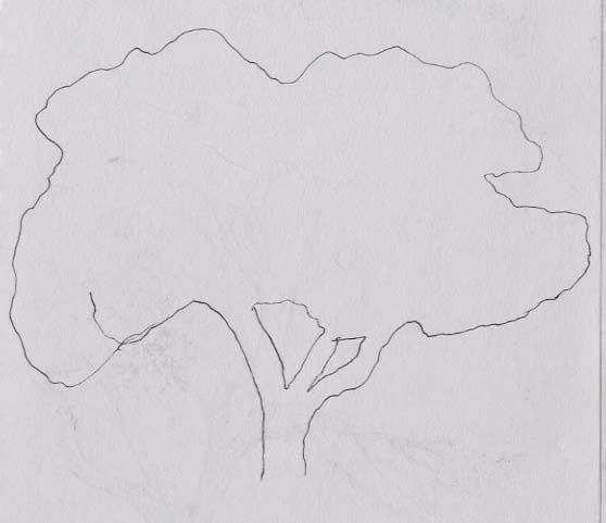
Outline
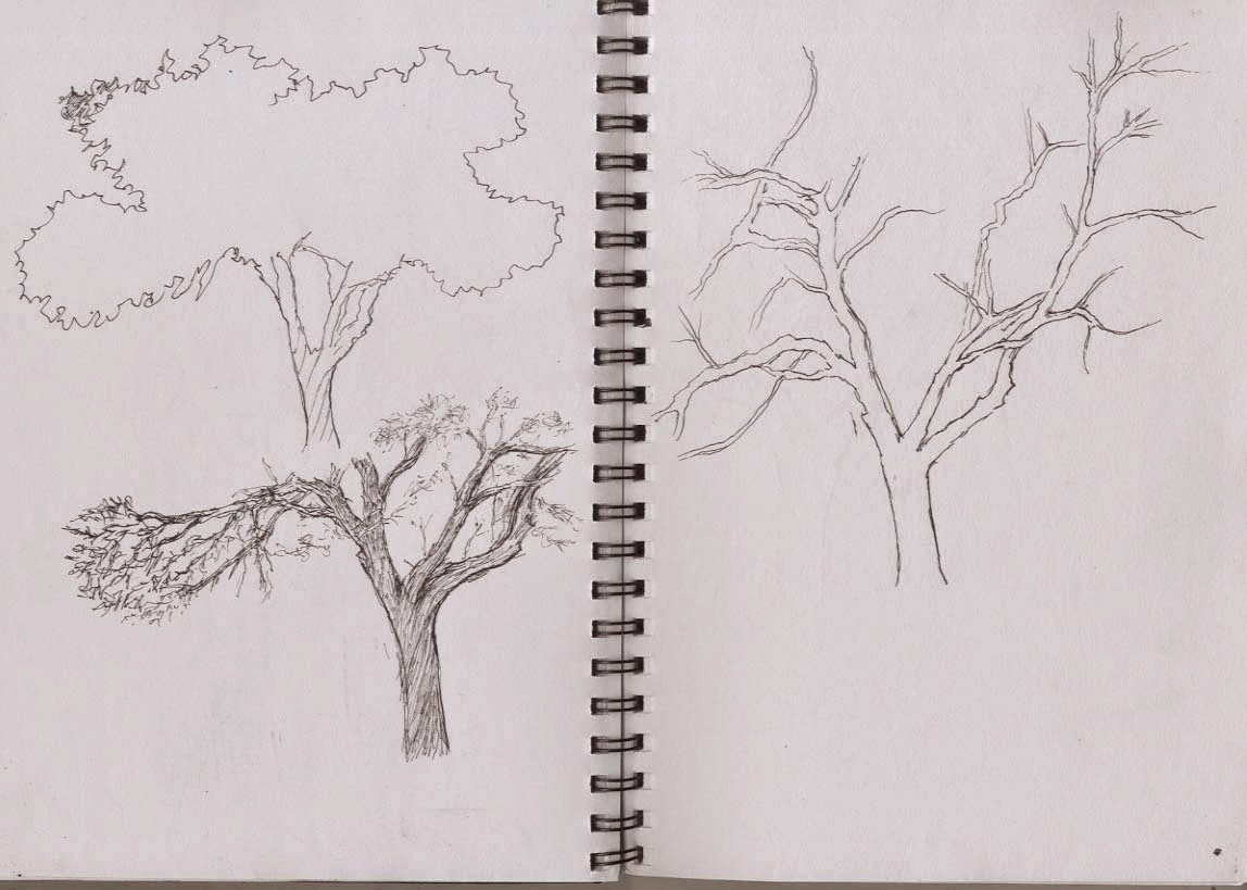
basic shapes, trunk and main branches
texture of branches
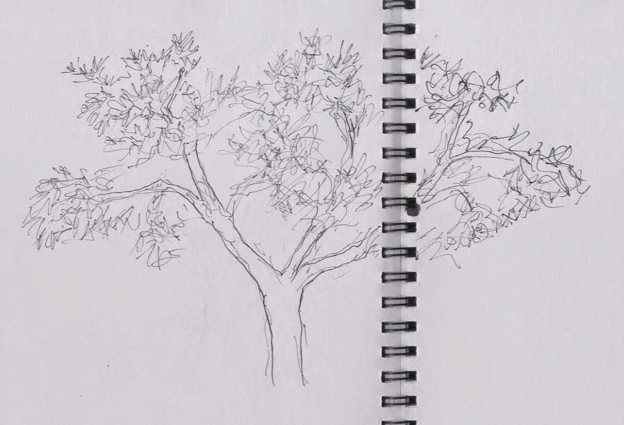
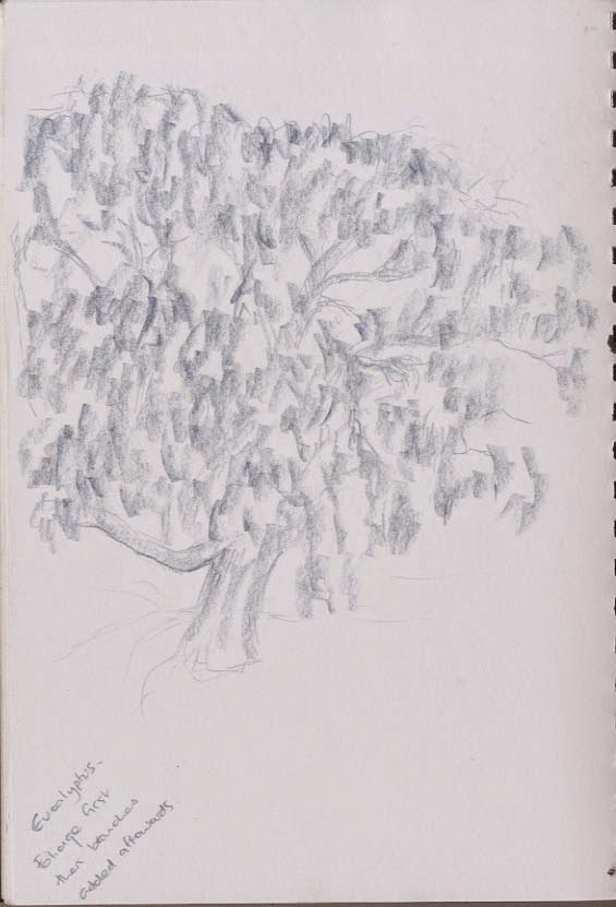
 As there aren't any leaves on the tree I chose I couldn't do the texture of the foliage so I changed trees and drew the eucalyptus tree in my garden which always has it's leaves.
Graphitint pencil on paper
I also tried to embrace the dark and drew in orange pencil on black paper
It's very feint now it's been scanned but I've posted it to give you an idea (it didn't work out very well in real life either but it was a bit clearer)

Sunday, 8 February 2015

Assignment 2

The choice for this assignment is still life, an animal study or an interior scene. Initially I was tempted by still life as I have a hyacinth which is flowering beautifully,
Coloured ink and dip pen, felt tip and water
but I wasn't sure which way I wanted to take it and I thought of trying to combine an animal study in an interior scene.
This corner is Henry's favourite interior scene so I'm sure to find him here but it's a bit dull.

The brief also asks to experiment with idea material and method. I don't usually use conte and charcoal to draw animals from life and I would like to further explore the idea of doing an animal study in the style of a life drawing. These are studies in my sketchbooks, the ones above are charcoal and conte, the ones below are fineliner and pencil where I was exploring his anatomy.
I like working on a medium tone coloured ground adding lights and darks to show form, but I have never done this with live animal studies so I bought some coloured sugar paper.
  Not sure about these so I went back to my sketchbook and pencil
Then back to the sugar paper

These three studies were done on a A2 sized sheet so individually they are quite small.
This is A1. I'm pleased with it in that it's done from life using sweeping side strokes with the conte stick in a style I might use in a life session and it captures the way that Henry (who is rather neurotic) was worried that I had a large board erected in the room and I was studying him. However it's not a very exciting drawing if you don't know Henry or like dogs very much. I didn't put the background in either as I thought it would be a bit distracting. I know it's best to draw animal and background together but I knew I was time limited as he would not hold that position for very long and my memory is limited so I needed to get as much detail as possible down while he held the pose. In fact he did move his head quite a lot so  I had to grab details as I went along.
With this in mind I decided I needed a more interesting pose and did some more sketchbook studies


I think the curled up position is more interesting even though it's less dynamic so working from my studies I did another conte drawing on sugar paper trying to use the techniques I used for these earlier studies.

There is an irritating kink in the paper which was there when I bought it. I wanted this colour and there were only 2 sheets left both with the kink, I'm hoping it will iron out if I put something heavy on it. Henry alone was still a bit dull so I added a cat to add some tension. I don't think this picture could take any background but I'm troubled by the general lack of background in all these pictures so I went back to this earlier picture
He could be unsettled because he is waiting for his owner to return in which case he could be sitting outside the front door.
I wanted to try a different approach where I laid down a charcoal background and drew into it with a rubber.
I loosely drew a bookcase and pillow but found it difficult to get good whites with the rubber so I added some white conte which didn't show up very well.
Some more work with the rubber and a little brown conte
Is this any better? I think it needs a bit more colour so I added some blue pastel.
I find drawing relatively easy, what is difficult is using it to create an interesting composition and I'm not sure I've achieved that here. For all three drawings I used a limited colour pallet to give some consistency. I think charcoal, conte and pastel are good mediums to capture animals, the softness gives the feel of fur without drawing every hair.
This picture has the best contrast in tone 
This probably uses the widest variety of lines and has a more interesting context than the other two, but the dog in front of the bookcase may be a better composition. They are all accurate depictions of form but that may not be a positive feature, I tend to slavishly follow form and could do with being a bit less accurate at times. I have tried to be experimental in my approach to the picture making with techniques I wouldn't usually try